I notice the same thing every time I audit a Shopify store: the product is fine, the photos are fine, but the variant selector still feels like a settings panel. When that happens, the store is making people work too hard to choose a color or a style.
The swatch apps I keep coming back to are the ones that make choices feel native to the theme instead of bolted on top of it. That is the part I care about most, and it is why I spent time looking closely at Supra Swatch Colors, the Shopify App Store listing, and the setup material before I would recommend it to anyone.

The first thing I look for
I do not start by asking, “How many swatch styles does it have?” I start with a simpler question: will this app make the product page easier to read without making the theme look custom-built in a bad way?
For me, a good swatch app has to do five things well:
- Work on product pages without forcing theme code changes.
- Support collection pages so the browsing experience stays consistent.
- Handle both built-in variants and linked products.
- Offer enough visual control that the swatches feel on-brand.
- Stay fast, because swatches are supposed to reduce friction, not add it.
That is the shortlist I use before I care about anything else. If an app misses one of those pieces, the rest of the feature list starts to matter less.

Why the visual details matter
Most stores do not lose sales because they lack a color selector. They lose sales because the selector does not help the shopper decide quickly.
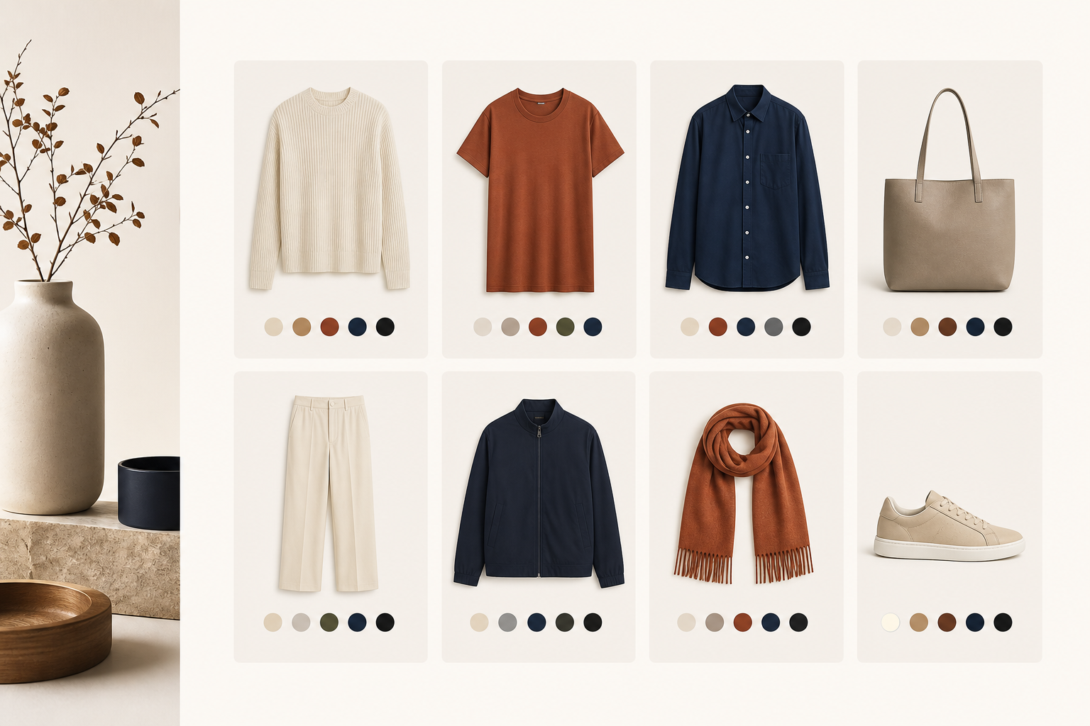
That sounds small, but it changes the whole product page. A dropdown says “there are variants here.” A swatch says “these are choices you can understand at a glance.” If the swatches are styled well, they become part of the merchandising instead of a utility control.
I like that Supra Swatch Colors gives you enough control to fit the brand without turning the setup into a design project. It supports color and image swatches, auto-detects store colors, and gives you a lot of styling room without requiring a developer to patch the theme.
Collection pages are the real test
Product pages are where the decision happens. Collection pages are where the shopping starts.
If the collection page still hides color choices behind a click, the store is asking customers to open too many product pages just to compare styles. That is usually where swatches earn their keep. They make the grid easier to scan, and they make the catalog feel more organized even when there are a lot of variants.
That is also why I think collection-page support matters more than most app listings admit. The swatch system should not stop at the PDP. It should help the shopper across the whole browse flow.
If you want the practical version of that setup, I would read How I Set Up Shopify Color Swatches on Product and Collection Pages Without Code and How to Turn Shopify Variants Into Brand-Matched Swatches next.

Linked products change the problem
There is a second case that matters just as much: when the store does not really have variants, it has closely related products that should be grouped visually.
That is where linked products are useful. A shopper can jump between related items without feeling like they left the same product family. In practice, that can mean colors, materials, or closely related SKUs that should be browsed together.
This is the part where I would pair this app with How to Build a Shopify Swatch System for Variants and Linked Products and How I Replaced Dropdown Variants With Shopify Swatches That Load Instantly. Those posts get into the practical tradeoffs; the short version is that swatches make more sense once you stop treating every option as a dropdown problem.

What I would test before rolling it out
If I were setting this up on a real store, I would not start with every product at once. I would test one high-traffic collection and one important product family first.
My checklist would look like this:
- Pick one product with obvious color or material choices.
- Turn on the swatches and compare the page on desktop and mobile.
- Check the collection page to make sure the grid still scans cleanly.
- Test a linked-product case if the catalog uses related SKUs.
- Confirm the styling still feels consistent in the theme header, footer, and product page.
- If the store is multilingual, verify that the labels still behave the way the merchant expects.
That is enough to tell me whether the app is solving a real merchandising problem or just adding a prettier control.
The setup path I would choose
If I had to start from scratch, I would begin with the app site, then check the app store listing, then watch the setup material before changing anything on the live theme. That keeps the decision grounded in the actual store instead of in a demo.
The reason I am comfortable with Supra Swatch Colors is simple: it covers the two places that matter most, product pages and collection pages, and it does it without turning every change into a developer task. The YouTube tutorial on getting started is also useful if you want to see the basic workflow before installing it.
If you want a broader comparison mindset, the most relevant follow-ups are How to Build a Shopify Swatch System for Variants and Linked Products and How I Replaced Dropdown Variants With Shopify Swatches That Load Instantly. For a more detailed variant-first setup, How to Turn Shopify Variants Into Brand-Matched Swatches is still one of the cleaner reference points.
The takeaway
The best swatch app is not the one with the most options on the feature page. It is the one that makes the product feel easier to choose from without making the site feel heavier.
That is the standard I use, and it is the reason a tool like Supra Swatch Colors stands out: it can make variant choices, linked products, and collection browsing feel like one system instead of three separate hacks.
Comments
Post a Comment