If your Shopify store still uses dropdowns for color options, you’re leaving conversions on the table. Shoppers expect to see color swatches right on the product page—and even on collection pages—so they can preview styles without extra clicks. In this guide, you’ll learn the fastest, no-code way to add color swatches to both product and collection pages using Supra Swatch Colors.
What you’ll get:
- Instant-loading color and image swatches that fit any theme
- Options to convert variant dropdowns into swatches or link separate products with swatches
- Built-in collection page swatches to boost browsing and reduce pogo-sticking
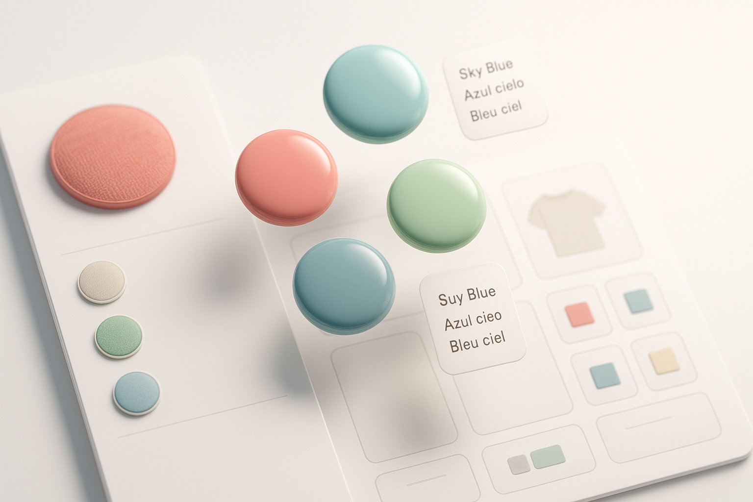
- 20+ styles with full control over size, shape, labels, fonts, tooltips, and more
- Multilingual support and zero code edits
Call to action: Install Supra Swatch Colors on the Shopify App Store: https://apps.shopify.com/swatch-colors-ultimator
Why color swatches matter for Shopify SEO and conversions
Color swatches make product discovery visual. They:
- Increase click-through on collection pages by previewing colorways instantly
- Reduce returns by setting accurate expectations
- Improve time-on-page and internal linking when using linked-product swatches
- Strengthen accessibility with labeled, keyboard-navigable options
Meet Supra Swatch Colors: the ultimate Shopify swatch system
Supra Swatch Colors is a high-performance, no-code swatch app that works across product and collection pages on all Shopify themes. It’s built for speed, scale, and flexibility.
Highlights:
- Highly customizable color and image swatches with 20+ unique styles
- Works with variant color options or by linking separate products via swatches
- Built-in collection page integration (no theme edits required)
- Auto-detects store colors or uses product images to set swatches fast
- Multilingual support and instant loading for a seamless UX
Try it now: https://apps.shopify.com/swatch-colors-ultimator

Step-by-step: add color swatches to Shopify product pages
Follow these steps to turn your variant dropdowns into beautiful swatches in minutes.
1) Install the app
- Go to the Shopify App Store: https://apps.shopify.com/swatch-colors-ultimator
- Click Add app and follow the prompts.
2) Choose your mode: Variants vs. Linked Products
- Variant swatches: If your product uses a Color option within a single product (e.g., “Color: Red, Blue, Green”), convert that option into swatches.
- Linked-product swatches: If each color is its own product (separate pages and SKUs), create a product group and link them via swatches so shoppers can switch colors without leaving the page.
3) Auto-detect or define swatches
- Use Auto-detect to convert color names (e.g., “Navy”, “Cream”) into the correct swatch tones.
- Prefer visuals? Select image swatches using product photos or custom texture chips for finishes (leather, woodgrain, glitter, matte).
4) Customize the design (20+ styles)
- Size and shape: small, medium, large; circular, rounded, or square
- Labels and tooltips: show color names, enable tooltips, choose font and contrast
- Borders and states: selected, hover, disabled (for sold-out variants)
- Accessibility: ensure 4.5:1 contrast on labels and tooltips
5) Enable on product pages
- Toggle Product page integration inside the app
- Preview in your theme editor to verify placement near the Buy/Add to cart button
- Optional: enable “Hide sold-out swatches” or “Show cross-out style”
Pro tip: Keep your color option name exactly “Color” (or localized equivalent) to ensure automatic mapping.

Add color swatches to Shopify collection pages (no code)
Collection page swatches allow shoppers to preview colorways and jump straight into the right variant.
1) Enable collection swatches
- In Supra Swatch Colors, turn on Collection page integration
- Choose how many swatches to show per product card and the overflow style (e.g., “+3”)
2) Configure behavior
- On hover: show tooltip with color name
- On click: update product image or navigate to the corresponding variant/product
- Choose small swatch style to preserve card space
3) Test and publish
- Open a collection in your storefront, hover swatches, and click through
- Confirm fast image switching and variant selection carries into the product page

When to use linked-product swatches vs. variant swatches
Choose the model that best fits your catalog and SEO strategy:
- Use variant swatches when colors share one product page and SKU family, simplifying inventory.
- Use linked-product swatches when each color has unique images, titles, URLs, or metadata you want indexed separately. Swatches become an internal navigation UI that reduces bounce while preserving distinct SEO pages.
Both modes are supported side-by-side in Supra Swatch Colors and can be mixed by collection or product type.
Performance, multilingual, and theme compatibility
- Instant loading: Swatches render immediately for a frictionless shopping experience.
- Multilingual support: Localize option names and tooltips for global stores.
- Universal theme support: Works across all Shopify themes on product and collection templates—no code edits required.
More details: https://supra-swatch-colors.sktch.io/
Design and UX best practices
- Keep it consistent: Use the same swatch shape and size across the site.
- Show names: Tooltips or labels help color-blind users and reduce returns.
- Use image swatches for patterns: Marble, camo, floral, wood, or metallic finishes benefit from a photo chip instead of a flat color.
- Limit noise: Display 4–6 swatches per card on collections; use “+N” overflow for the rest.
- Accessibility: Ensure keyboard navigation and focus states are visible.

Video tutorials (watch and implement in minutes)
- Supra Swatch Colors — Shopify App to add Color Swatches to Products: https://www.youtube.com/watch?v=k8uyugxH9To
- Getting Started — Tutorial: https://www.youtube.com/watch?v=K_2l9G1ibIo
- How to Link Shopify Products with Color Swatches: https://www.youtube.com/watch?v=H9LOX-vOjYI
- How to add Swatches on the Collection pages of your Shopify Store: https://www.youtube.com/watch?v=FKZQpBrAJQQ
Troubleshooting and FAQs
- Swatches not showing? Ensure your Color option is enabled and spelled consistently. Then verify the Product page integration toggle in the app.
- Using a custom theme section? Re-add the app block in the theme editor and check placement near the Buy button.
- Colors look slightly off? Override auto-detected colors with precise HEX values or upload image swatches for exact textures.
- Want to hide unavailable options? Enable “Hide sold-out swatches” or “Disable with strikethrough” for clarity.
- Can I manage thousands of swatches? Yes—use product groups and bulk tools inside the app to scale fast.
Launch swatches today
Make your product discovery visual, fast, and on-brand. Add color swatches to product and collection pages in minutes—no code, all customization.
Install Supra Swatch Colors now: https://apps.shopify.com/swatch-colors-ultimator
Need more info? Visit the site: https://supra-swatch-colors.sktch.io/
Comments
Post a Comment