Why color swatches matter on product pages
Color swatches turn guesswork into confidence. Instead of making shoppers read a dropdown, swatches let them see instantly which color or finish is in stock. That improves UX, reduces returns, and boosts conversion. If you run a fashion, beauty, home, or accessories store, Shopify color swatches can:
- Increase clicks on key variants and shorten time to purchase
- Reduce wrong color selections and size exchanges
- Showcase full assortment on both product and collection pages
- Improve internal linking and navigation when linking separate color products
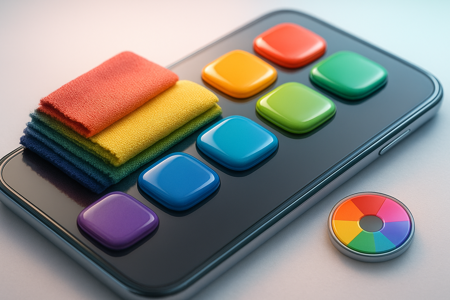
Below is a fast, reliable, no code way to add Shopify product page swatches and collection page swatches using Supra Swatch Colors.
The fastest way: add swatches with Supra Swatch Colors
Supra Swatch Colors on the Shopify App Store adds beautiful, blazing fast color and image swatches to product and collection pages. It supports both scenarios:
- Variant swatches for products that use one product with color variants
- Linked-product swatches for stores that create a separate product per color
Highlights:
- 20+ styles with full control over size, shape, border, tooltip, labels, and fonts
- Works on all Shopify themes, product and collection pages, multilingual ready
- Auto-detects brand colors or uses product images for instant setup
- Loads instantly for a seamless experience
Learn more on the app site: supra-swatch-colors.sktch.io

Step by step: add Shopify product page swatches
Follow these steps to get live swatches in minutes.
1) Install the app
- Go to the listing: Install Supra Swatch Colors
- Click Add app and approve permissions
- The app auto-detects your theme and can enable product and collection page integration without code
If you prefer a visual walkthrough, watch the quick start video: Getting Started Tutorial
2) Choose your swatch mode
Use the path that matches how you structure products.
- Variant swatches: you have one product with variants for Color or Finish. Example: T Shirt with Color Black, White, Navy.
- Linked-product swatches: each color is a separate product with its own URL. Example: T Shirt Black is one product, T Shirt White is another.

3) Configure variant swatches
If you use variants:
- Ensure your option name is Color or Colour or any label you use for color. The app can map it.
- In the app, enable Product page integration for swatches.
- Choose how to render swatches:
- Auto detect colors used in your store
- Use product images as swatch thumbnails for photo-accurate finishes
- Pick your style: round, square, or pill; adjust size, border, spacing; enable tooltips and labels.
- Save and preview on a product with color variants.
4) Configure linked-product swatches
If each color is a separate product, link them into a group:
- In the app, create a product group for the family of products.
- Add each color product to the group and assign a swatch color or an image.
- Choose which product is the default view and how the swatch click behaves:
- Stay on the same page and update media and URL
- Navigate to the specific color product page
- Save and test on the live product page.
This approach improves internal linking and helps shoppers jump between colors without hunting in navigation.
5) Customize look and feel
Supra Swatch Colors offers 20 plus preset styles and deep customization:
- Shapes: circle, rounded square, square, pill
- Sizes: compact micro to large hero swatches
- Borders and shadows for contrast on light or dark themes
- Tooltips with color names or custom labels
- Image swatches for patterns, prints, wood grains, metallic finishes
- Typography controls for labels to match brand guidelines
- Accessibility tweaks: focus rings and readable labels
Pro tip: If two colors are visually similar, keep both but add clear labels and use image swatches so customers can spot subtle differences.
6) Enable swatches on collection pages
Turn on collection page integration so shoppers can preview and switch colors before they even land on PDPs. This reduces pogo-sticking and improves discoverability of in-stock shades.
- In the app, toggle Collection page integration
- Pick a compact style and enable quick view or swatch hover tooltips
- Test grid responsiveness on mobile
Watch: How to add Swatches on the Collection pages of your Shopify Store

Best practices for SEO and conversions
- Use descriptive variant names: Navy, Sky Blue, Midnight rather than ambiguous labels. This helps search and improves tooltips.
- Prefer image swatches for patterns and materials so thumbnails communicate texture.
- Preserve accessibility: ensure sufficient color contrast, add tooltips or labels, enable focus states for keyboard users.
- Keep URLs clean for linked products and use consistent handles. Swatches that link products help users and crawlers discover alternatives.
- Surface swatches above the fold on product pages and enable collection page swatches to improve click depth and engagement.
Troubleshooting and tips
- Theme conflicts: Supra Swatch Colors works on all Shopify themes, but if custom sections hide the default variant selector, enable the app integration block or contact support in the app.
- Swatch order: Reorder variants in Shopify or sort within your product group to control display order.
- Performance: The app is optimized to load instantly. Large image swatches should be compressed for the fastest experience.
- Multilingual shops: Translate labels and tooltips using your language app. Supra Swatch Colors is built for multilingual setups.
- Color names vs hex codes: Auto detect picks the closest visual color. For brand-critical shades, set a custom hex or use image swatches.
Helpful videos
- Overview: Supra Swatch Colors — Add Color Swatches to Products
- Getting started: Setup tutorial
- Link separate products with swatches: How to Link Shopify Products with Color Swatches
- Collection page swatches: How to add swatches on collection pages
Launch your swatches today
Ready to upgrade your PDPs and category grids with fast, on-brand swatches? Install the app in minutes and customize every detail without touching code.
- Install now: Supra Swatch Colors on the Shopify App Store
- Learn more and see examples: supra-swatch-colors.sktch.io

Comments
Post a Comment