If your Shopify catalog looks good one product at a time but inconsistent as a grid, the problem is usually not the product. It is the visual system.
That is why I like using Supra AI Photo Studio when I need to clean up source photos, create lifestyle scenes, generate on-model visuals, and turn still images into short product videos from the same starting point. The landing page frames it well: the goal is not just prettier photos, but a repeatable way to make product imagery feel coherent across the store.
What you will learn
- How to define consistency for a Shopify catalog
- How to use one clean source photo across multiple outputs
- When to use studio, lifestyle, try-on, and video assets
- How to check whether the set still feels like one brand
What Consistency Means In Practice
Consistency does not mean every image must look identical. It means a shopper can move from one SKU to another without feeling like they have landed in a different store. The biggest variables are crop, background tone, contrast, shadow softness, and how much scene context you add.
If you want the step-by-step version of the same idea, How to Create Studio-Quality Shopify Product Photos From Plain Shots is a good companion read. This post focuses on how to keep the whole set coherent once you start generating more than one version.
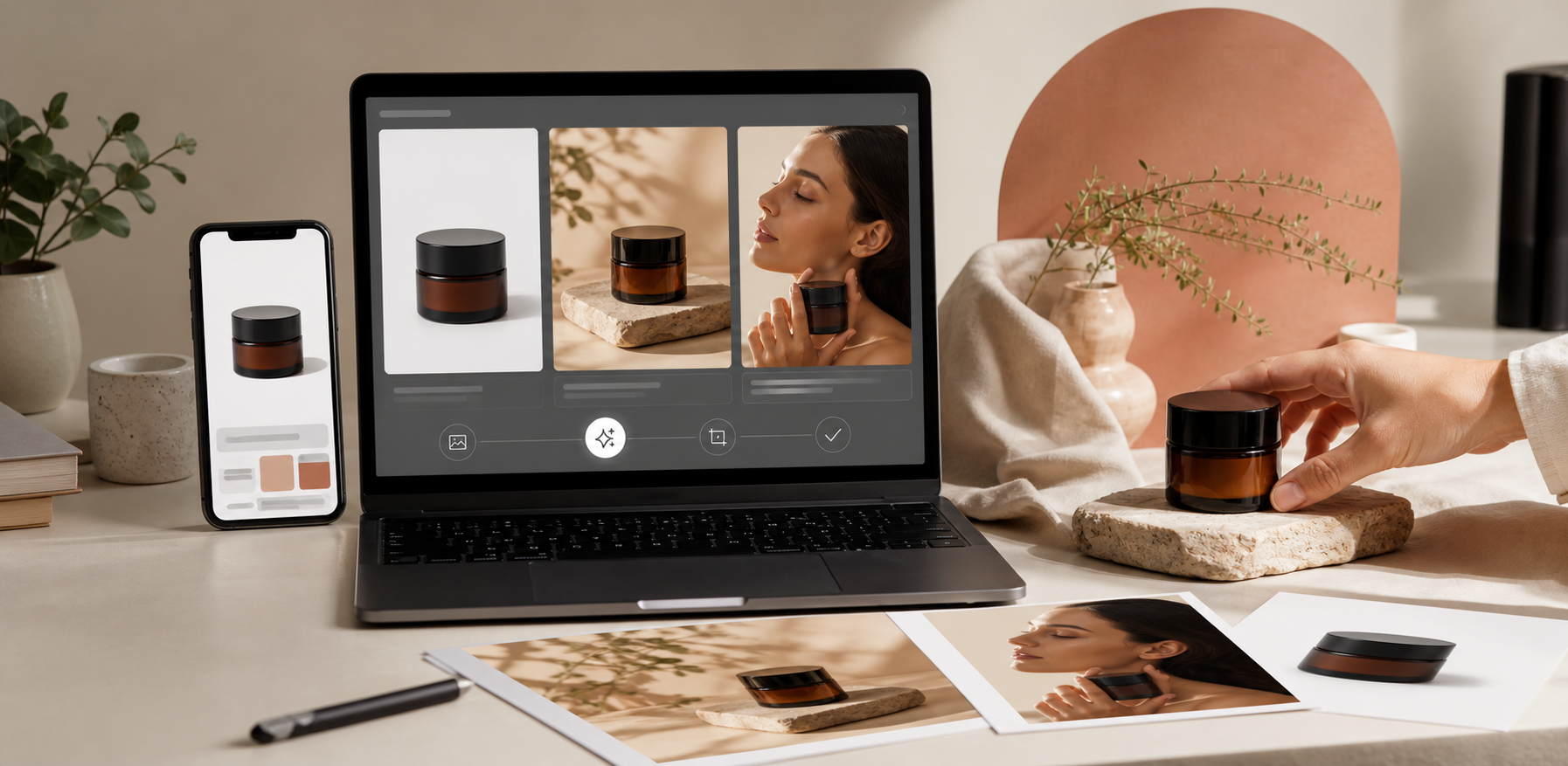
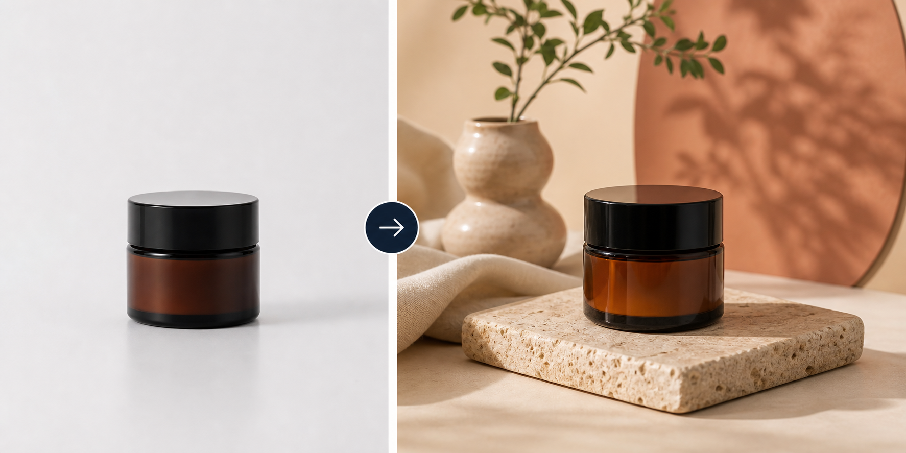
Start With One Clean Source
I always start with the cleanest source photo I can find. If the edges are rough, the lighting is uneven, or the crop is wildly different from the rest of the catalog, every downstream image gets harder to standardize. In Supra AI Photo Studio, the workflow is simple: pick a product or upload a photo, use the tools to improve it, and keep the result visible while you compare variants.
The app listing makes the promise very clear: turn basic photos into consistent, professional visuals for product pages, ads, and social content. That is the angle I would use when I want a catalog to feel designed instead of assembled.
For a broader repackaging workflow, How to Turn Plain Product Photos Into Shopify Marketing Assets shows how a single image can feed more than one channel without losing the brand look.
Use Context Sparingly And Intentionally
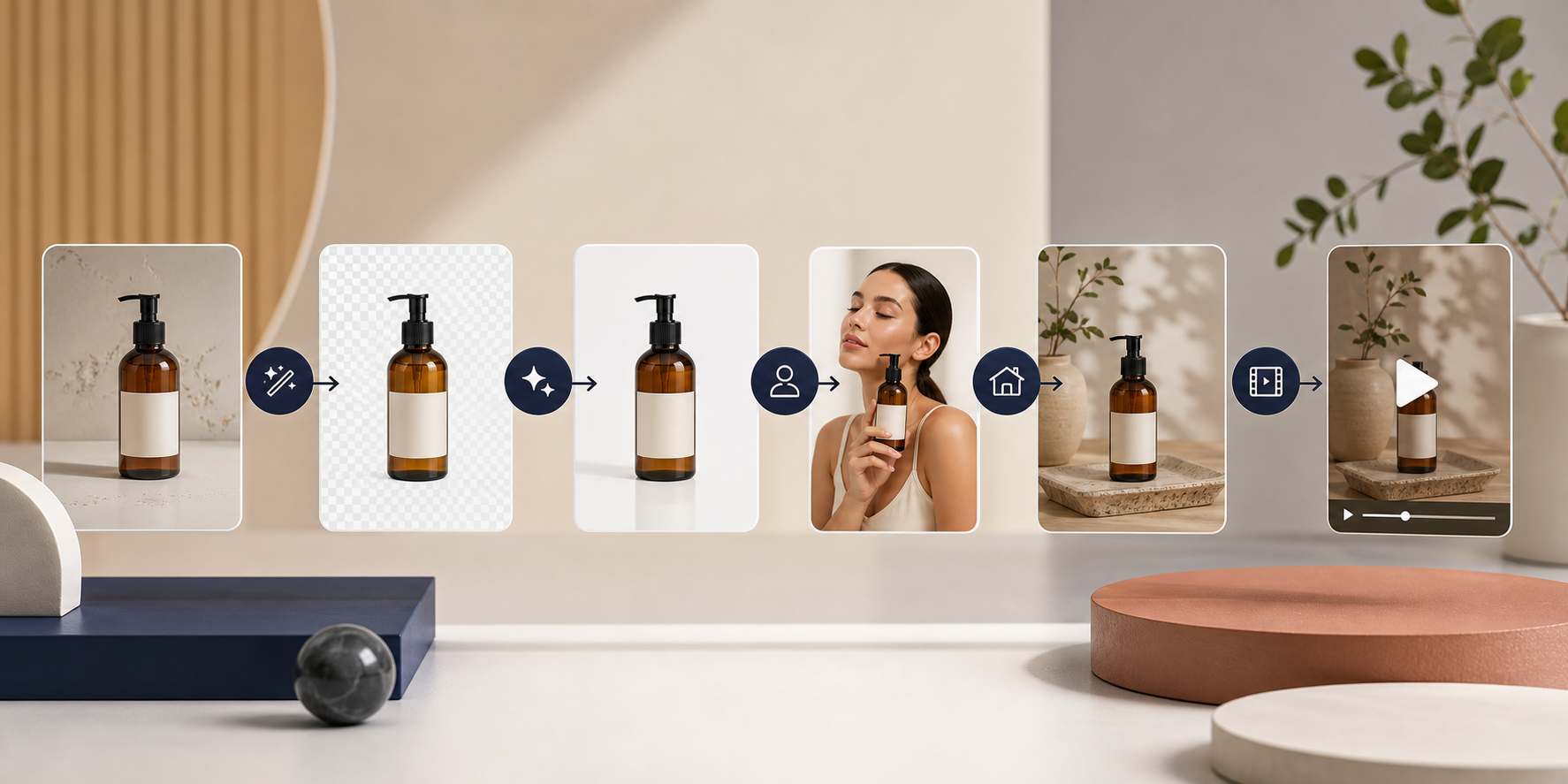
Once the base image is stable, you can decide how much context each product needs. Some products want a pure studio look. Others need a lifestyle scene or an on-model shot. Supra AI Photo Studio supports both object placement and AI try-ons, which is useful when a catalog needs variety without drifting into a different visual language.
The rule I use is simple: the more competing products a shopper sees in one collection, the more important consistency becomes. A clean on-model image can help fashion and accessories. A warm lifestyle scene can help home goods. But if you use both styles in the same collection without a plan, the page starts to feel inconsistent.
If you want the lifestyle side of the workflow, How to Create Lifestyle Product Photos for Shopify Without a Shoot is the closest adjacent read.

Carry The Same Style Into Video
Consistency gets even harder once you add motion. The good news is that the same source image can support short video content too. Supra AI Photo Studio includes UGC videos and b-roll videos, which means you can keep the same product story across the catalog, the ad set, and social clips.
That is also why I like linking still-image work with motion planning. If you are already thinking about what a product should look like in a short clip, it becomes easier to standardize the stills first. For a deeper motion workflow, How to Create UGC-Style Product Videos for Shopify Without Hiring Influencers and How to Build a Shopify UGC Video Testing Matrix are the two most useful follow-ups.
You can also use the same logic from How to Turn One Product Photo Into Listings, Lifestyle Shots, and Ads: decide the job of each asset before you generate it. Once the job is clear, the image set stays tighter.
A Quick Pre-Publish Check
- Do the images share the same crop family?
- Do they use the same background tone?
- Are the shadows and contrast close enough to feel like one catalog?
- Does the lifestyle context support the product instead of distracting from it?
- Would these assets still feel consistent if you placed them side by side on a collection page?
If one SKU breaks the pattern, regenerate it. Small inconsistencies become much more obvious on Shopify than they do in a single isolated image.
If you want the fastest path, start with your cleanest source photo and standardize five products in the same visual style. That is usually enough to see whether the workflow is working.
A good place to start is the Supra AI Photo Studio app listing, the landing page, and the demo trailer. The practical question is simpler: can you turn one good source into a consistent set of assets without wasting time in multiple tools? If the answer is yes, the catalog usually looks better very quickly.
Next step: pick one product line, generate a matching clean shot, lifestyle version, and on-model or ad-ready version, then compare them on a collection page before you roll the style out across the rest of the store.
Comments
Post a Comment