How to Make Shopify Product Photos Look Consistent Across Your Catalog
If your Shopify catalog looks like it was photographed by four different brands, the fix is not necessarily a reshoot. I have seen small stores get a much cleaner storefront by defining a repeatable photo system first, then using it on the images they already have.
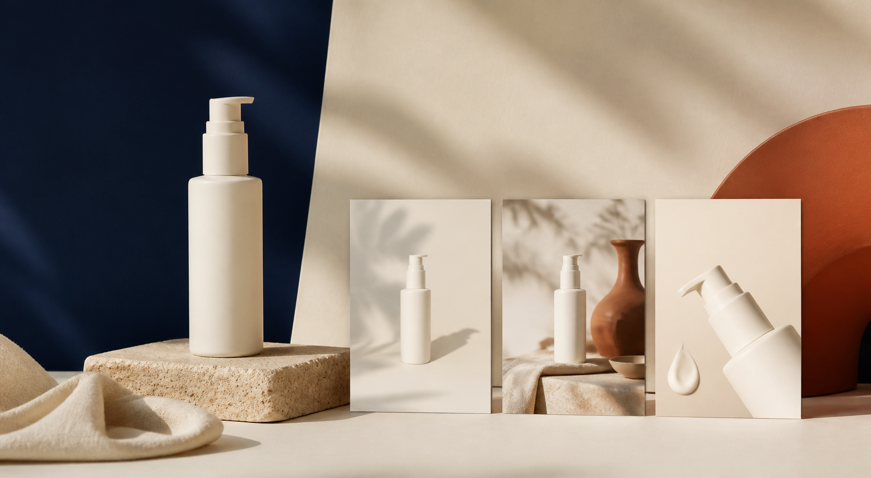
The goal is not to make every image identical. It is to make every image feel like it belongs in the same store: similar crop logic, lighting direction, background choices, and product detail. That helps shoppers compare products faster and makes collection pages feel more trustworthy.
TL;DR: choose a small set of image roles, write down a few non-negotiables, test them on one product, then roll the system through the catalog with a review step. Supra AI Photo Studio can help with the editing work—background cleanup, lighting enhancement, upscaling, lifestyle placement, and try-on—without sending every asset to a separate design workflow.
Start with image roles, not random edits
Before opening an editor, decide what each image is meant to do. For many stores, a dependable set is:
- Primary image: clean product identification; shoppers should understand the item instantly.
- Detail image: texture, material, finish, scale, or a feature that answers a buying question.
- Context image: a lifestyle or in-use scene that shows how the product fits into real life.
- Proof image: packaging, fit, comparison, or another practical confidence-builder.
This is different from chasing a new aesthetic for every listing. A shopper can handle variety when they can still recognize the job of each image. If you are rebuilding a photo process from scratch, my guide to turning one product photo into a reusable shot list is a useful companion.

Set four consistency rules that are easy to review
A style guide only works if someone can check it quickly. Keep yours short enough to use while publishing a product. I would start with four rules.
1. Keep the main product clear
Your primary image needs the same basic promise across the catalog: the product is centered or consistently offset, large enough to inspect, and unobstructed. A white or neutral background can work well, but it is not the only option. What matters is that the product reads immediately.
2. Use a repeatable crop and camera feel
Choose a few standard crops: for example, square primary images, a close material detail, and a wider lifestyle scene. Avoid switching randomly between tiny product cutouts, distant room shots, and dramatic angles. For apparel, use the same level of zoom and similar pose logic across comparable products.
3. Match light before matching background
Background changes are noticeable, but inconsistent shadows and color temperature usually make a catalog feel messier. Pick a lighting direction: soft front light, warm natural side light, or even high-key studio light. Then check that your product color still looks believable. AI enhancement can clean up sharpness, lighting, or distracting backgrounds, but it should not turn a navy bag into a different shade of blue.
4. Repeat a limited scene vocabulary
For lifestyle assets, choose two or three environments that make sense for your customer. A home-goods store might use a warm shelf, a clean countertop, and a lived-in room. A fashion store might use a studio, a neutral street setting, and a close fabric detail. This gives you variety without losing recognition.

Build the system on one representative product
Do not start by editing fifty products. Pick one item that has the usual challenges in your catalog: a tricky material, a meaningful color, a need for a close detail, and a reason to show it in context. Create all four image roles for that item and put them on a draft product page.
That small test reveals the rules you forgot to write down. Maybe lifestyle images need more negative space for the product title area on mobile. Maybe your details work better at 4:5 than square. Maybe a background replacement makes the product edge look too artificial. Adjust the system before you scale it.
This is also where you should separate fixes from transformations. Use enhancement, background removal, and upscaling to make a good source image easier to use. Use object placement or virtual try-on when the new context genuinely helps the shopper understand the product. I use the same decision principle in my Shopify photo decision system: every image should have a defined purpose before it earns a slot on the page.
Use AI as a controlled production step
AI photo tools are most useful when they follow your system rather than invent it. In Supra AI Photo Studio, start with the clearest source image you have. If the original has distracting surroundings, isolate the product first so the tool has a clean subject. Then give specific instructions for the desired scene, lighting, surface, and camera angle.
A prompt such as “put this product in a nice room” leaves too much open. A better instruction is: “place the product on a warm oak shelf, soft daylight from the left, neutral cream wall, product centered with visible label area, no extra objects touching it.” The point is not poetic prompting; it is repeatable art direction.
For apparel, use try-on to keep your model choices consistent across a collection. For hard goods, use object placement to establish a small set of approved environments. For existing photographs, use background cleanup and image enhancement before generating a completely new scene. If your issue is deciding which images deserve work first, the photo triage board approach will keep credits focused on the highest-impact listings.
Add a lightweight approval gate
The fastest way to break consistency is to publish generated images one at a time without comparing them to the rest of the catalog. Give every new image a final review beside its product page and a collection page. I use five questions:
- Is the product shape, color, and key detail accurate?
- Does the crop match similar products?
- Does the lighting belong with the rest of the collection?
- Does this image have a job that another image does not already do?
- Would a shopper recognize this as our store without seeing the logo?
If the answer to one is no, revise or hold it. That is not unnecessary perfectionism; it prevents a polished individual image from creating a messy catalog. For a more detailed pre-publish review, see my three-pass check for AI product photos.

Roll out by collection, then protect the standard
Once the pilot looks right, update one collection at a time. Start with products that get traffic or sit together on a key collection page. Save your accepted crops, scene descriptions, and review questions in a short internal note. That turns one successful edit into a repeatable process for the next launch.
You do not need a large studio to make a Shopify catalog feel coherent. You need a small, testable image system and a way to apply it consistently. Start with one representative product this week, build its four image roles, and use Supra AI Photo Studio to clean up or create the assets that are missing. Then compare the finished page to the collection around it before you publish.
Comments
Post a Comment