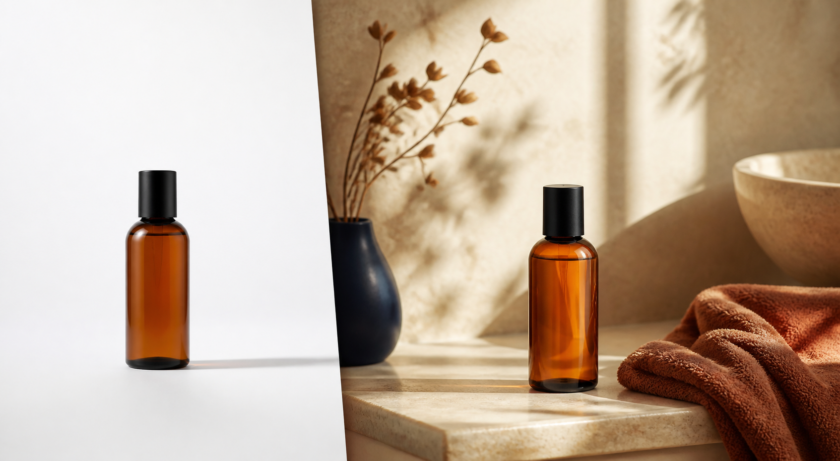
If you want to test lifestyle product photos on Shopify, start with one product that is easy to recognize, has a simple shape, and already gets enough attention to teach you something. Don’t begin with your most complicated bestseller. A small, controlled test will tell you far more than a dramatic catalog-wide makeover.
I’ve seen stores spend weeks generating scenes for dozens of SKUs, only to discover that the first photos made the product look smaller, changed its color, or buried the reason shoppers came to the page. The better move is to choose one product, create a small set of purposeful images, and review them before expanding.
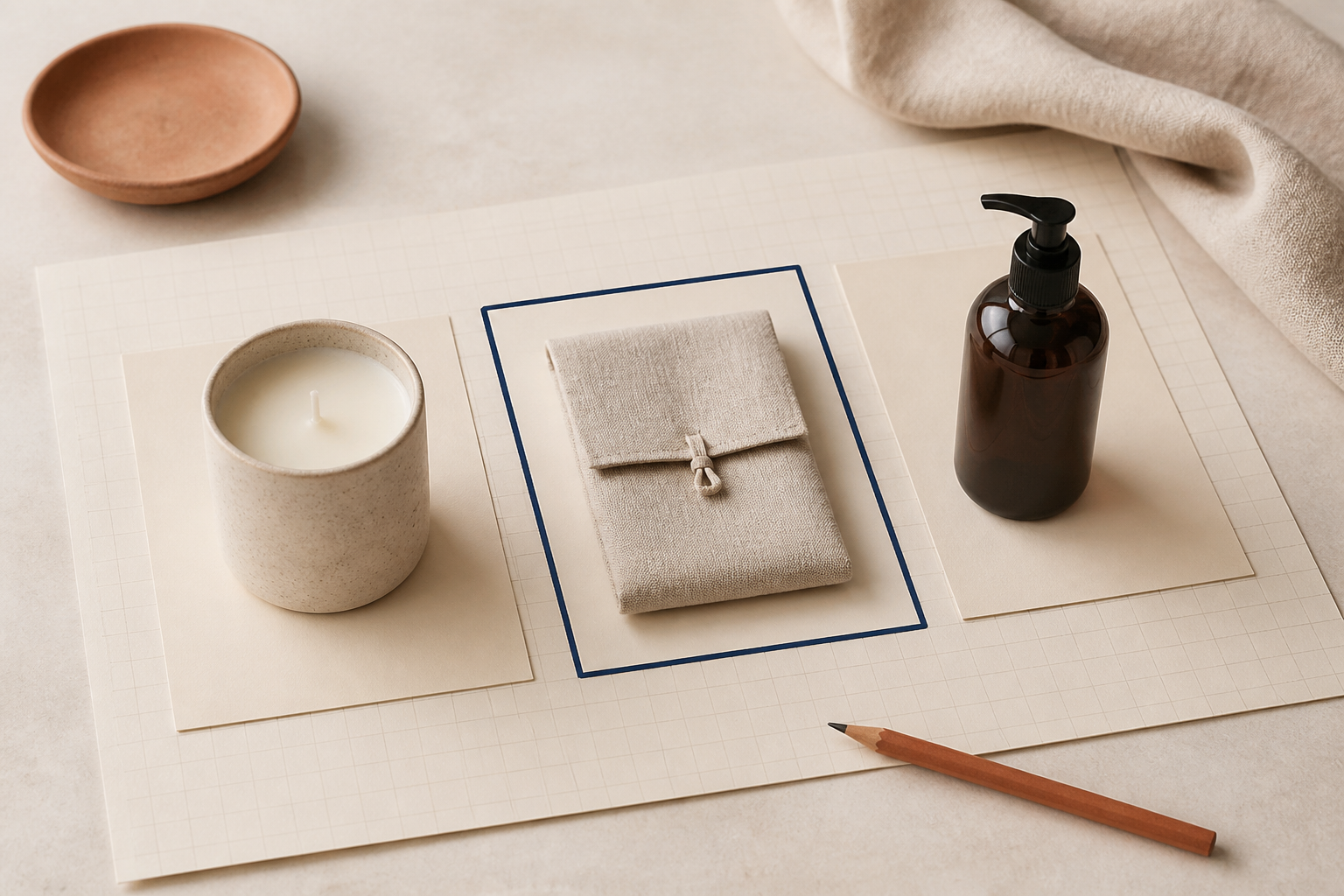
Start With a Product Shoppers Can Identify Instantly
Your first test product should have a clear silhouette and a straightforward job. Think of a candle, water bottle, skin-care bottle, tote, mug, or simple jewelry piece. A shopper should be able to tell what it is in a second, even when it appears in a room or on a surface.
Avoid products with delicate construction, dense patterns, many options, or details that need a close-up to sell. Those products can work later, but they make it harder to tell whether a result failed because of the scene or because the product needs more careful handling.
Use this quick filter:
- It has one primary angle that already performs well as a packshot.
- Its real color and material are easy to check.
- You can describe a believable use setting in one sentence.
- It has enough traffic or sales activity for you to gather feedback.
If you need help narrowing a group of candidates, this reusable Shopify photo shot-list approach is a useful companion: it helps separate the must-have angles from the nice-to-have creative ones.
Make the Lifestyle Scene Support the Product’s Job
The setting should answer a shopper’s quiet question: “Where would I use this?” A hand soap can belong beside a sink. A travel tumbler can live on a commuter desk. A linen napkin can sit on a laid table. The scene does not need to be expensive or elaborate; it needs to make the product easier to imagine owning.
This is where Supra AI Photo Studio is useful. The Shopify app can turn an existing product photo into a lifestyle scene, improve lighting and sharpness, and help you remove or replace a background. Its object-placement tools let you define the environment, surface, camera angle, and lighting rather than treating every image like a random creative experiment.
Keep the first brief small: one setting, one time of day, one surface, and one composition. For example: “Place this amber bottle upright on a warm stone bathroom counter in soft window light; keep the bottle shape and color accurate.” That gives you a result you can actually evaluate.
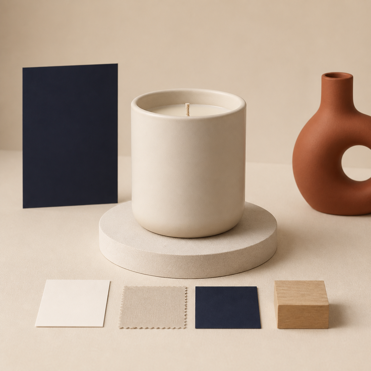
Protect the Details That Sell the Product
A lifestyle image is not a replacement for your core product image. It is supporting evidence. Keep your clean packshot, then add the lifestyle version where it can add context without creating doubt.
Before you publish, zoom in and check four things:
- Shape: Is the product’s outline, proportions, and opening still believable?
- Color: Does the finish still match the real product under the scene’s lighting?
- Material: Do glass, fabric, metal, or wood details still read correctly?
- Scale: Does the surrounding scene make the product seem unusually large or small?
If the product is not cleanly isolated first, fix that before asking for a new setting. Our guide on replacing a Shopify product background without changing the product walks through the same principle: protect the merchandise first, then change the context around it.
Test a Three-Image Set, Not a Single Hero
For a first product, I’d create three images: the original clean product image, one practical lifestyle scene, and one tighter detail or alternate angle. This gives shoppers a stable reference point and gives you a fair basis for review.
Supra AI Photo Studio also includes image enhancement and background tools, so you can start from the existing product image instead of recreating the asset from scratch. Keep the app’s output close to the source photo, especially for a test: you are trying to learn whether context helps, not whether a completely new visual identity can attract a click.
Run the set by the same pre-publish checks you would use for any AI-assisted product image. This three-pass product-photo review is a practical way to separate visual polish, product accuracy, and page fit before the images go live.
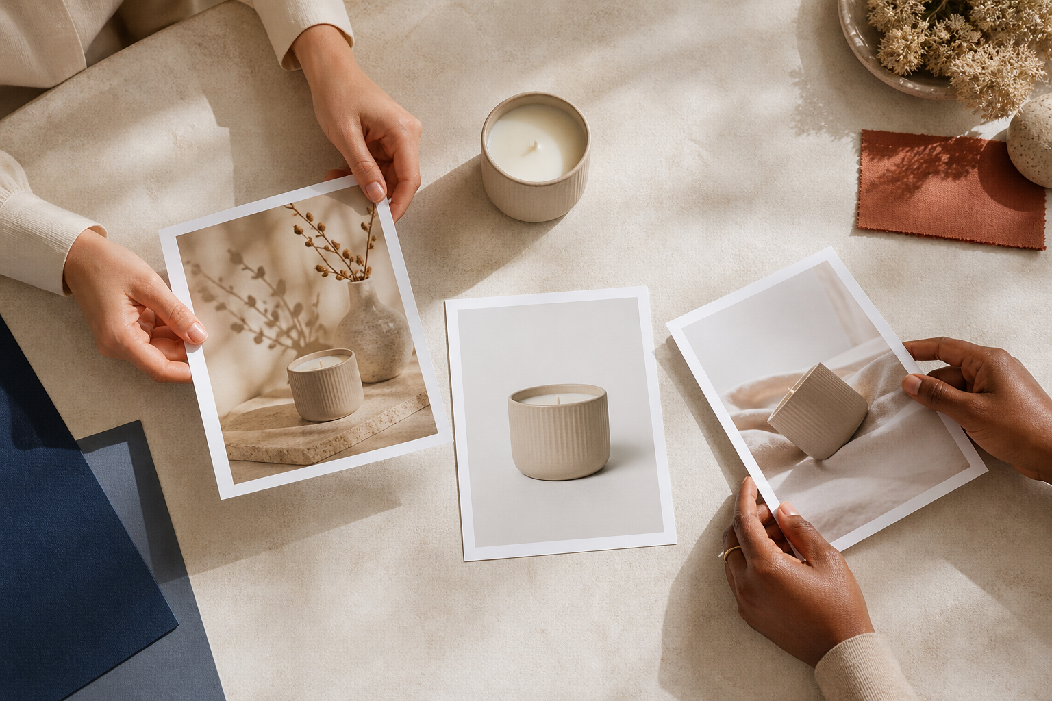
Ask for One Clear Decision From Your Review
Don’t ask, “Do we like these?” Ask a question the test can answer: does the lifestyle photo make the product’s use case clearer without reducing confidence in the item itself?
Have one or two people compare the images at the actual product-page size on desktop and mobile. Watch for hesitation around color, scale, or what is included. If you use the image in an ad, make sure the landing-page photo feels consistent with what the ad promised.
If the scene works, repeat the same recipe for a small product family: same lighting direction, similar surface, and the same amount of visual breathing room. If it does not, keep the original product photo as the anchor and adjust only one variable—usually the surface, framing, or amount of background. A Shopify product-photo QA checklist can help turn those lessons into a repeatable approval step.
Your Next Step
Pick one simple, high-visibility product today. Write a one-sentence scene brief, create one lifestyle image beside the existing packshot, and review it against shape, color, material, and scale. You can try Supra AI Photo Studio from your Shopify admin to make that first controlled test without rebuilding your photography workflow.
The goal is not to make every product look cinematic. It is to help the right shopper picture the real product in their life—and to learn a repeatable visual system before you scale it.
Comments
Post a Comment