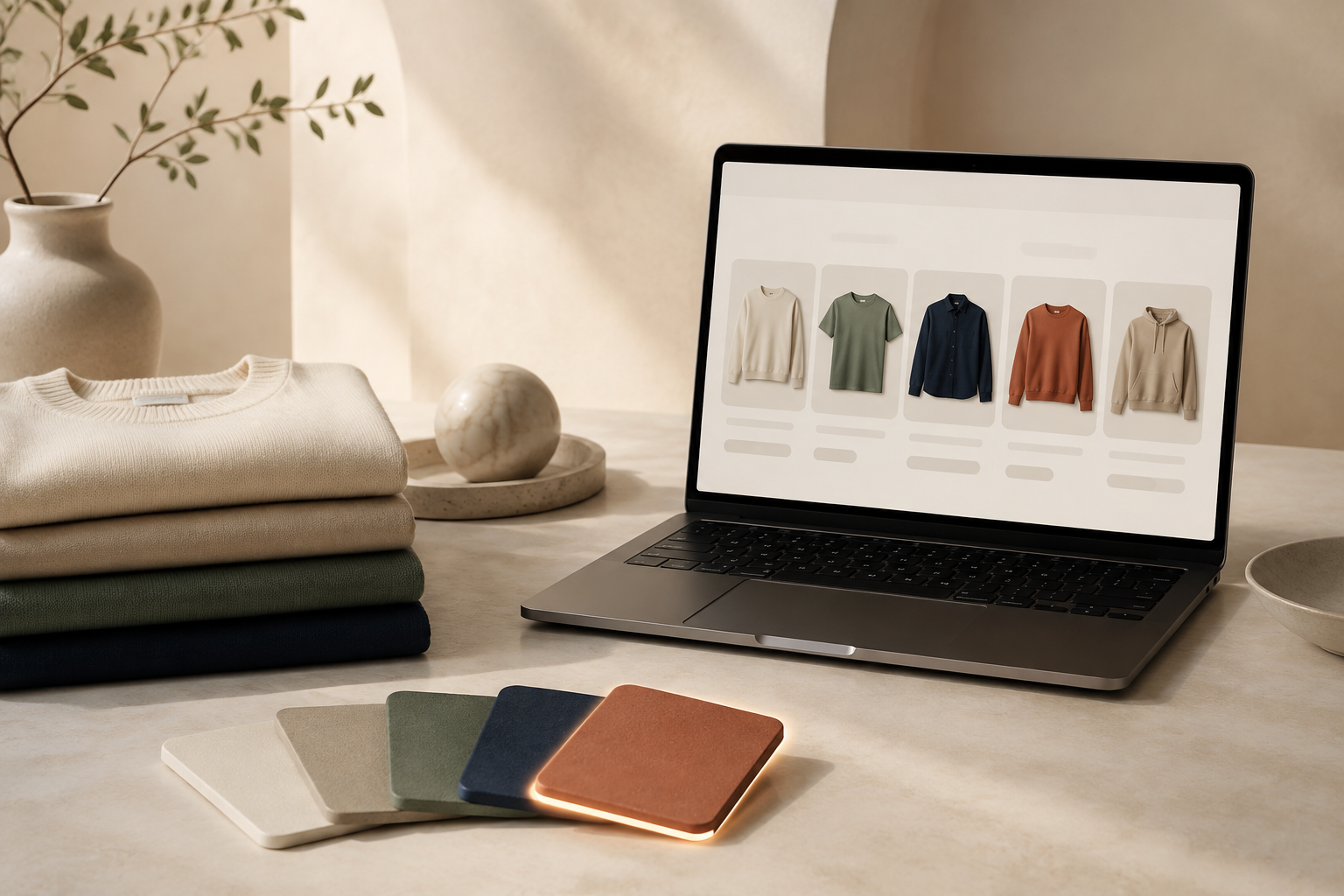
If shoppers have to decode a dropdown to tell navy from charcoal, the option selector is doing too much work. Clear color and image swatches make the choice visual at the moment it matters: on the product page and, for many stores, before the shopper even clicks through from a collection.
TL;DR: Use a swatch when the option is easier to recognize than to read. Start with your highest-traffic color or finish variants, keep the swatch-to-product relationship honest, and test the collection page as carefully as the product page.
Start With the Shopper’s Actual Choice
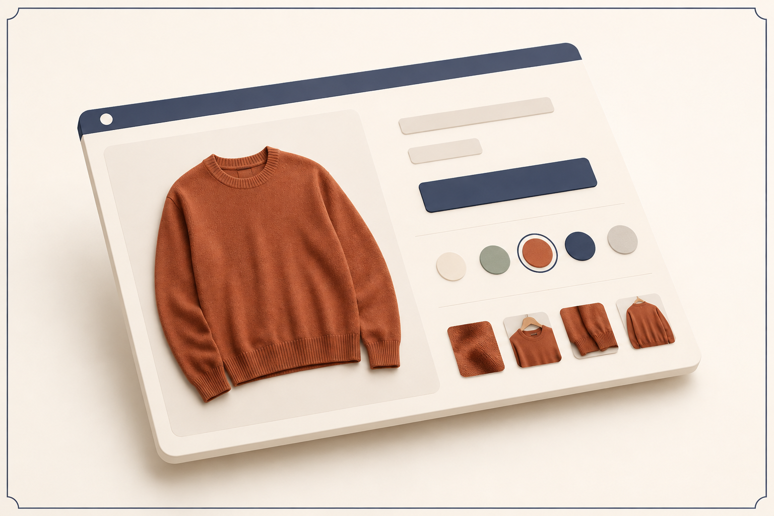
A swatch is not decoration. It answers a question: “What will I get if I choose this?” That is especially useful for apparel, cosmetics, home goods, and any catalog where color, material, or pattern changes the buying decision.
I have seen stores add swatches everywhere and accidentally make simple options harder to scan. The clean rule is to reserve them for visual choices. Size can stay as text; colors, finishes, patterns, and fabric treatments usually deserve a visual cue.
Before touching your theme, list the option values a shopper should be able to compare at a glance. Then decide whether each choice is a variant of one product or a separate product page. That distinction keeps inventory, merchandising, and links from becoming muddled later.
Choose Between Variant Swatches and Linked Products
Use variant swatches when the item is fundamentally the same product: one tee in five colors, or one candle in two finishes. The chosen swatch should update the selection without implying that the shopper has navigated somewhere else.
Use linked-product swatches when each color or style has its own product page, imagery, description, or merchandising story. A shopper viewing a linen overshirt in sage can move naturally to the navy product page through its swatch. This approach is often easier to maintain when each colorway needs dedicated photography.
Supra Swatch Colors supports both paths: turn Shopify variant options into color swatches or link separate products into a visual group. It also gives you color and image swatches, auto-detected store colors or product-image setup, and styling controls for the details that make a swatch feel native to your store.
For a walkthrough of linked products, the product team’s short setup video is a useful companion to the checklist below.
Make the Swatch Easy to Understand
A swatch earns its place only when its meaning is obvious. Give every option a readable label or tooltip, ensure the selected state is visible, and do not rely on color alone for distinguishing close shades. Image swatches help when a texture, print, or material matters more than a flat color chip.
Use your brand’s existing visual rules for size, shape, outline, and spacing. Supra Swatch Colors offers 20+ style options, so the aim is not to show every treatment; it is to select one that matches your product cards and product pages. Keep it comfortably tappable on mobile and make sure the selected state remains clear against light and dark backgrounds.
Put Swatches Where Discovery Happens
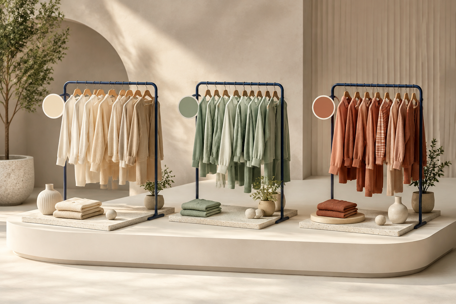
The product page is the minimum. Collection pages are where color-forward shoppers often make their first decision, particularly in apparel and home categories. If a shopper can see the available colors while browsing, they can choose a promising product with more confidence instead of opening several similar listings.
This is the same principle behind a color-first collection browse path: make a useful product difference visible early, then let the product page handle the rest. Supra Swatch Colors supports swatches on product and collection pages across Shopify themes, without needing to edit theme code.
If you are planning the broader collection experience, pair this work with a reviewable Shopify collection brief. It helps you decide which categories should lead with color, which need imagery, and which should remain a straightforward list.
Run a Small Swatch Test Before Going Storewide
Do not begin with every SKU. Pick a focused product family and test the shopper journey on desktop and mobile. A five-minute check catches most presentation issues:
- Open a product and choose each swatch. Confirm the selected color or image is unmistakable.
- Check every linked-product swatch. It should lead to the intended product page, not a near-duplicate or an unavailable item.
- Browse the collection page. Swatches should help comparison without making the card feel crowded.
- Test a long value name, a pale swatch, and a dark swatch. Labels and selected states need to stay legible.
- Repeat the path on a phone. The swatches should load promptly and remain easy to tap.

For a deeper QA pass, use this Shopify swatch rollout test guide. It is a practical safeguard before you apply the same pattern to a large catalog.
Keep the Setup Maintainable
A visual selector can become fragile if each product is configured as a one-off. Create a simple convention for color names, group related products consistently, and decide who checks swatches when new products are added. For multilingual stores, confirm the labels and visual cues still make sense in each storefront language.
The best swatch system feels almost invisible: shoppers recognize the option immediately, choose it confidently, and continue toward checkout. Start with one high-intent collection, set it up with Supra Swatch Colors, and use the test list before expanding across the catalog.
Conclusion
Better swatches reduce one small but expensive kind of hesitation. Make the visual choice clear on the product page, surface it early on collection pages, and verify the experience on mobile. Your next step is simple: choose one product family this week and replace its hardest-to-scan visual dropdown with a swatch group.
Comments
Post a Comment