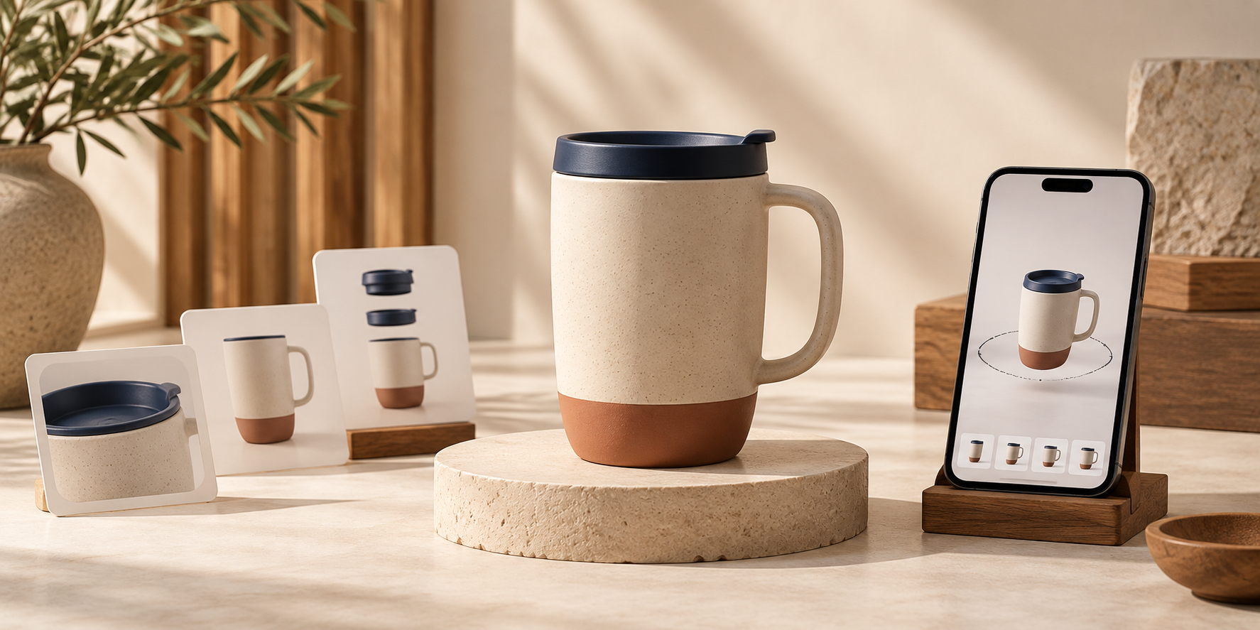
# How to Choose Your First Shopify Products for 3D Models
Your first Shopify 3D model should be a learning win, not the hardest item in your catalog. I have seen merchants start with a reflective bottle or a soft black sweater because it is a bestseller, then conclude that 3D is too complicated. Usually, the issue is the test SKU—not the idea.
The better starting point is a product with a clear shape, useful surface detail, and a real reason for shoppers to look around it. With Supra 3D Capture, you can use a guided set of phone photos to create a web-ready GLB, then publish it as Shopify product media or place it with an Online Store 2.0 app block. The practical question is: which product deserves that first scan?
TL;DR: pick the product that is easy to capture and worth exploring
Start with a physical product that has a matte or lightly textured surface, a distinct silhouette, and several meaningful angles. Think: a ceramic mug, a sneaker, a structured handbag, a small home accessory, or a piece of hardware with visible form. Avoid transparent, mirror-shiny, very dark, fuzzy, or extremely thin objects until you have a repeatable capture setup.
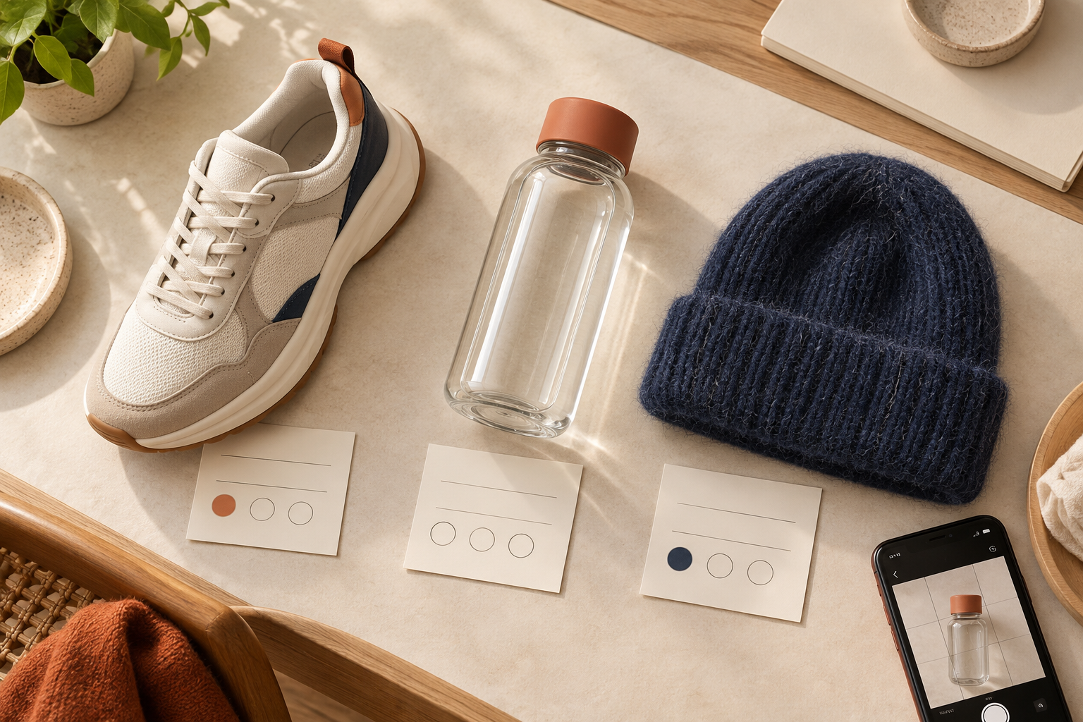
Use this five-point SKU scorecard
Before opening a capture session, give a candidate SKU one point for every statement that is true. A product that earns four or five points is a strong first 3D model.
1. Its shape answers a buying question
3D earns its place when a shopper benefits from rotating the item. A shoe can reveal sole depth and toe shape. A bag can show structure, handle drop, and side profile. A lamp or small piece of furniture can show proportion better than a front-facing image.
Ask: Would seeing the back, side, or underside make the product easier to understand? If the answer is yes, the model can close an expectation gap that a photo gallery leaves open.
2. It has a readable silhouette
Your first subject should separate clearly from its background. A product with a defined outline gives photogrammetry more consistent visual information as you move around it. Matte ceramics, textured leather, wood, and many finished consumer goods are sensible first choices.
Skip the most difficult catalog item for now: clear glass, polished chrome, highly reflective packaging, very soft fur, or a nearly featureless black object. Those products can be worth the effort later, but they are poor calibration tools for a new workflow.
3. It is small enough to orbit comfortably
A good first capture is one you can walk around—or rotate—without changing the lighting or losing your framing. I like starting with items that fit on a stable surface and can be photographed all the way around at a steady distance. You do not need specialist gear or LiDAR, but you do need a calm setup.
If your product is larger, make sure you have enough room to complete a smooth phone orbit. This Shopify 3D lighting setup guide is a useful companion before you begin.

4. It has useful texture and detail
Subtle visual landmarks help distinguish one angle from another: seams, grain, buttons, material transitions, and contours all give shoppers something to inspect. They also make the finished model feel more rewarding than a generic turntable spin.
That does not mean you should select the busiest product in the store. Choose visible detail with a stable surface. A ribbed planter is a better first candidate than a sparkling sequined garment; a structured wallet is easier than a translucent bottle.
5. Your theme can show the result well
A 3D model is only useful if it appears where shoppers can interact with it. Confirm that your theme supports Shopify’s native 3D product media, or plan to use a dedicated Online Store 2.0 app block. Run this theme support check before you commit time to a large batch.
A simple first-model shortlist
If your catalog is broad, make a shortlist of three products and compare them side by side. My usual order is:
- A hero SKU with a clear, tactile shape and moderate sales volume.
- A product that gets questions about scale, profile, texture, or construction.
- An item your team can photograph consistently again if you need a second attempt.
You can also borrow the logic from this low-risk Shopify 3D SKU scorecard and this catalog audit approach. The goal is not to prove that every SKU needs 3D. It is to find the one product where an interactive view is most likely to improve product-page understanding.
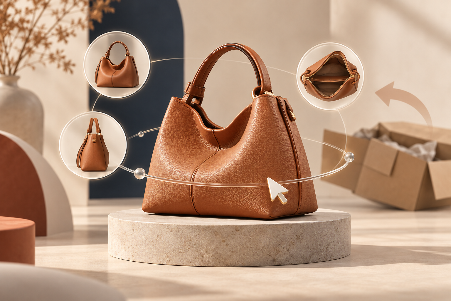
Capture the model, then judge it like a shopper
Once you have selected the SKU, create a guided phone-photo orbit in Supra 3D Capture. The app processes the images into an optimized GLB that can be attached to Shopify product media. When the model is live, test it on a real device—not only from your admin.
Check these three things:
1. Can a shopper rotate the product without hesitation?
2. Does the model reveal something the existing photos do not?
3. Does it make the product feel clearer, more tangible, or easier to compare?
If the answer is yes, you have a repeatable case for adding 3D to similar SKUs. If not, change one variable at a time: choose a simpler object, improve lighting, or retake the photo orbit. That is more useful than turning one imperfect scan into a verdict on the entire strategy.
Start with one product that deserves a closer look
A strong first Shopify 3D model is not necessarily your most expensive item or your highest-volume seller. It is the product where shape, proportion, and texture are part of the buying decision—and where a clean capture is within reach.
Pick one candidate today, score it on silhouette, detail, capture simplicity, shopper value, and theme readiness. Then try a guided scan with Supra 3D Capture on Shopify. One well-chosen interactive model is enough to show you where 3D product media belongs in your catalog.
Comments
Post a Comment