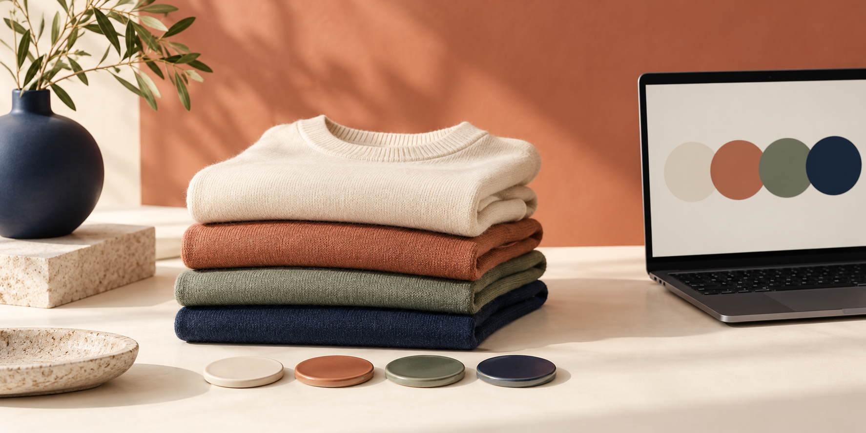
Most Shopify color-choice problems are not really design problems. They start when the store uses the wrong product structure, then asks shoppers to decode a dropdown that says ‘Blue’ or ‘Navy’ with no visual help. The clean fix is to decide whether a color belongs inside one product as a variant or deserves its own product page—then make that choice obvious with swatches.
Supra Swatch Colors gives you both routes without theme-code work: turn variant options into color or image swatches, or connect separate product pages as a visual color family. It can also show swatches on collection pages, which matters when a shopper is comparing several products at once.
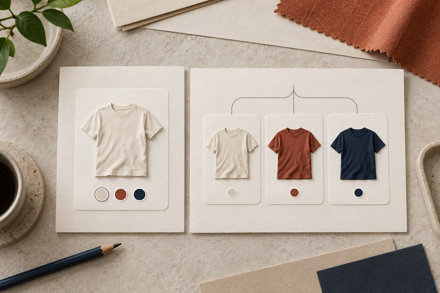
The quick answer: use variants when the product is fundamentally the same
Choose variants when color changes the look but not the core product. A cotton crewneck in ivory, terracotta, sage, and navy is usually one product with color variants. The shopper should stay on one page, choose a color, select a size, and add to cart.
Variants are the simpler route when these things remain consistent:
- The product title and description
- The price and merchandising story
- The size chart and care instructions
- The product photography, apart from the color itself
That is where circular color swatches earn their keep. Instead of reading a color name and hoping it matches the photo, the shopper gets an immediate visual cue. If your current selector is a dropdown, adding color swatches to Shopify collection pages is a useful next step once the product page is working well.
Use linked products when each color needs its own selling story
Create separate, linked product pages when a colorway has enough differences to stand on its own. Think of a jacket in a limited fabric, a seasonal edition with different images, or a product that needs a distinct title, search angle, inventory plan, or price.
I’ve seen stores try to put every related item into one enormous variant list. It looks tidy in the admin at first, but it can make photos, merchandising, and navigation harder for the customer. Linked products keep each product page focused while still letting a shopper move between colors through a familiar swatch control.
A practical decision rule: if you would write a materially different first paragraph for that colorway, give it its own product page. Otherwise, keep it as a variant.
Set up swatches in a useful order
Once the product structure is right, set the swatches up in the order shoppers make decisions. With Supra Swatch Colors, that usually means mapping your existing Color option first, then choosing a color or image swatch treatment that reflects the actual product. The app can auto-detect store colors or use product images, so you are not starting from a blank configuration for every item.
Start with this small checklist:
1. Standardize color names. Decide whether the option is ‘Forest’ or ‘Forest Green’ and use that exact name consistently.
2. Choose the truthful swatch source. A solid color is ideal for a true color swatch; a patterned, washed, or textured finish is often better represented by an image swatch.
3. Keep the selection visible. The selected state should be easy to spot without relying only on a tiny shade difference.
4. Check the matching product media. Selecting a swatch should make the relevant product image feel expected, not surprising.
If your products need more than colors—for example, separate care notes or expandable specifications—pair the swatch cleanup with a clearer product-page content structure.
Do not stop at the product page
A shopper often meets a color decision on a collection page, before they ever open a product. Showing swatches there helps them scan the range faster and reduces the ‘open, close, repeat’ loop that makes browsing feel like work. Supra Swatch Colors supports product and collection pages across Shopify themes, so the same visual language can follow the customer through the catalog.
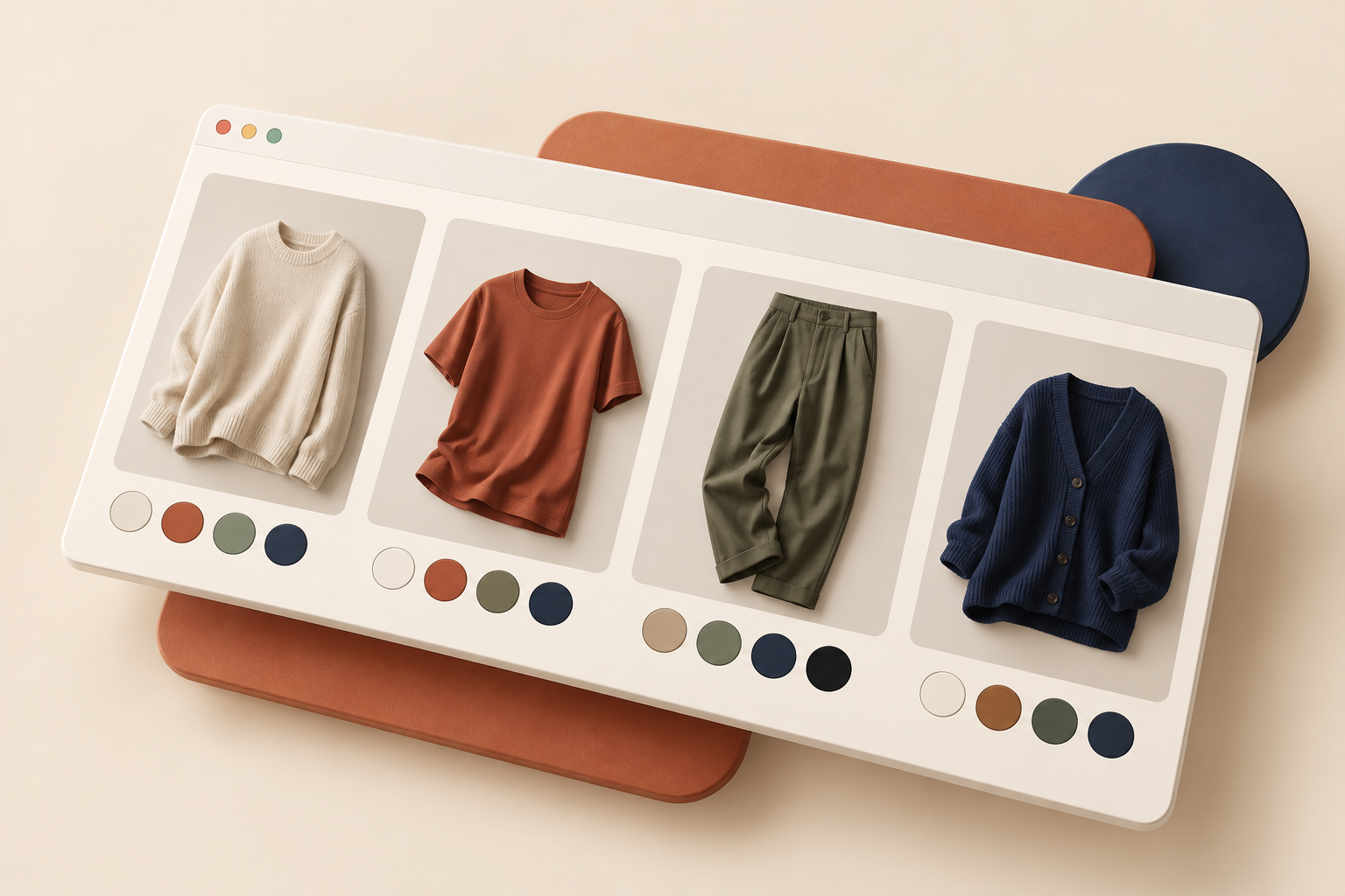
Keep collection-page swatches restrained. The goal is to help comparison, not turn every product tile into a control panel. Use a consistent swatch size, limit visual noise around unavailable options, and make sure the tile image still has room to sell the product. For a related workflow, see how to make Shopify size charts easy to read on mobile: the same mobile-first discipline applies to every small product-page decision.
Run a five-minute quality check before publishing
Before rolling swatches across the whole catalog, test a small set of products on desktop and mobile. Open one variant product, one linked-product group, and a collection page. Then ask:
- Can I tell the available colors apart at a glance?
- Does a color choice update the image or product destination correctly?
- Are the swatches comfortably tappable on a phone?
- Does the selected state remain clear in every theme context?
- Does a product with many colors still feel calm and easy to scan?

This check is especially important if you are making other pre-launch changes. Our Shopify size chart pre-launch checklist is a good reminder that small interface details are easiest to fix before traffic arrives.
Make the next choice obvious
The best swatch setup does not add decoration; it removes a question. Use variants for simple color changes, linked products for truly distinct colorways, and clear swatches wherever shoppers need to compare options.
Start with your five best-selling products, then try Supra Swatch Colors to give those choices a more direct visual path on both product and collection pages.
Comments
Post a Comment