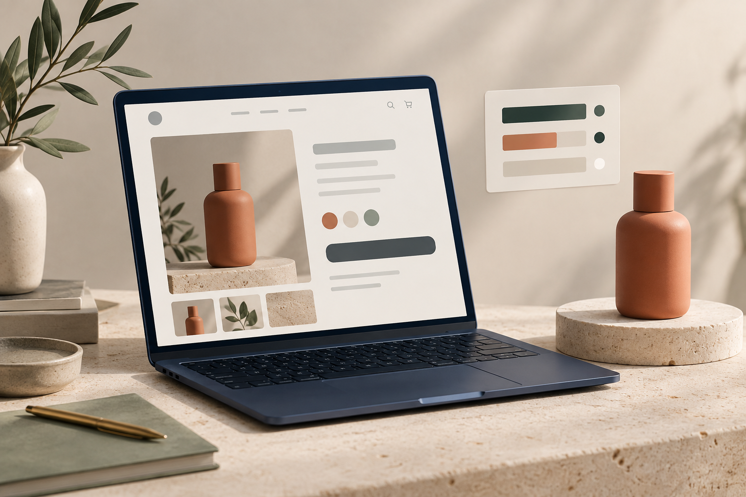
If a product page feels polished on your screen but shoppers hesitate to use it, check contrast before you change the design. On a Shopify page, a weak text-on-background pairing can make a price, variant label, shipping note, or add-to-cart button harder to read—especially on a bright phone outdoors.
I have seen this happen when a store pulls a beautiful muted color from its product photography and uses it everywhere. The color is on-brand, but it is not automatically usable behind small text. A quick pre-publish check keeps the visual identity while making the page easier to scan.
The short version
Use the colors that are actually on the page, test the important foreground/background pairs, then review the result in the real product template. Tiny Online Tools is handy here because its browser-based utilities let you sample, test, and prepare one-off assets without creating another account.
1. Start with the product-page moments that ask shoppers to act
Do not try to audit every color in your theme at once. Open one representative product page and make a short list of high-stakes combinations:
- product title and price on the page background
- selected and unselected variant states
- add-to-cart text and its button background
- sale badges, low-stock notices, and shipping promises
- accordion headings and links
This is the same reason I recommend a reusable product-page content system before adding more content blocks: repeated elements are where a small decision scales across the catalog.
2. Sample the real color instead of guessing
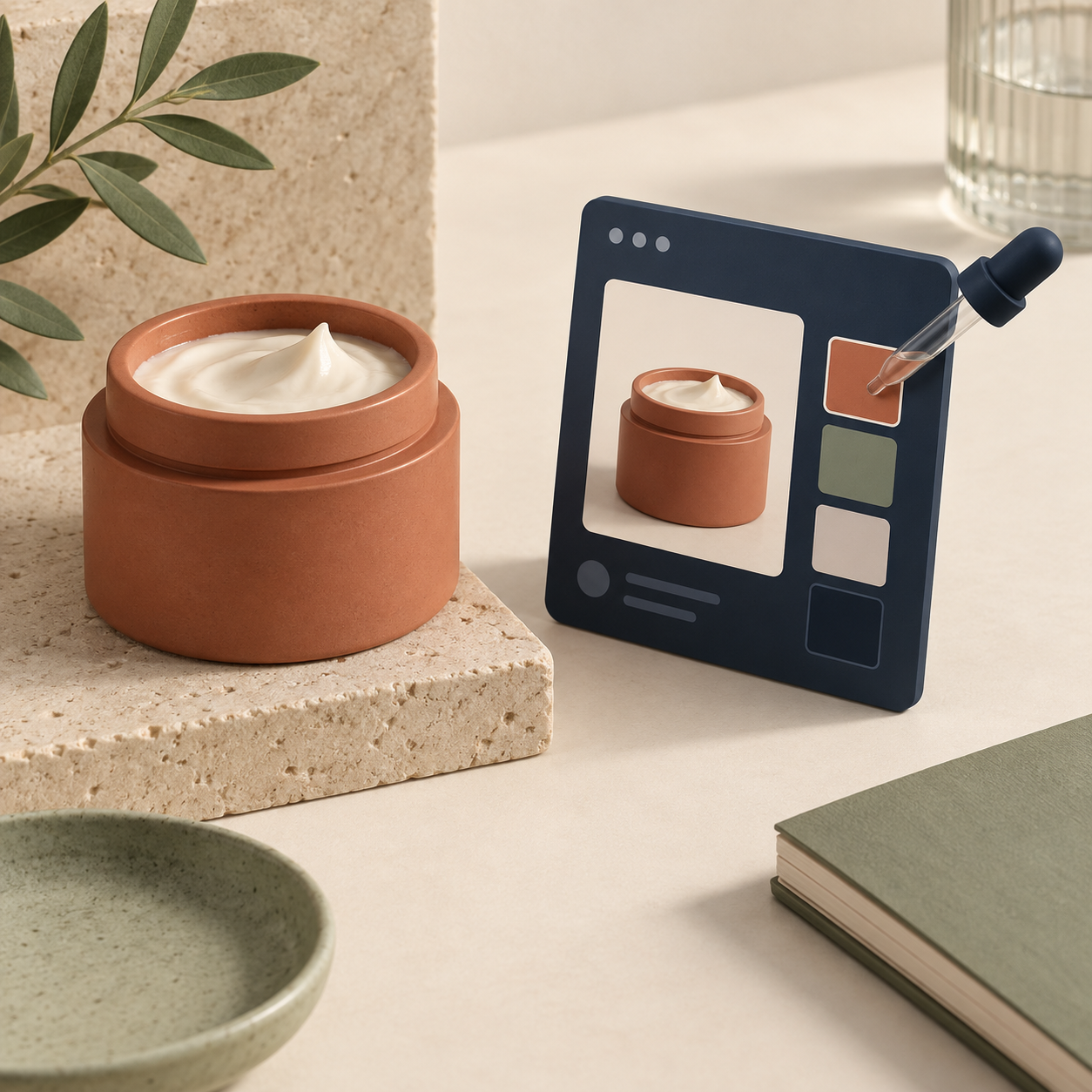
If the page pulls an accent from product photography, a campaign tile, or a brand asset, use the Image Color Picker to grab the exact value from that image. It shows hex, RGB, and HSL values, so you can copy the value into your theme setting or design notes instead of approximating it by eye.
This is useful when the art direction is deliberate. Say a candle label uses a dusty terracotta, but the collection banner is a lighter crop of the same product. Sampling the actual pixels shows whether the two assets are really using one shared color or only look similar. It also makes handoff conversations clearer: the team can test one exact pair rather than debating a screenshot.
For a broader product-photo workflow, pair this step with a Shopify product photo shot list. Consistent images make both merchandising and color decisions easier to repeat.
3. Test each important pair at normal text size
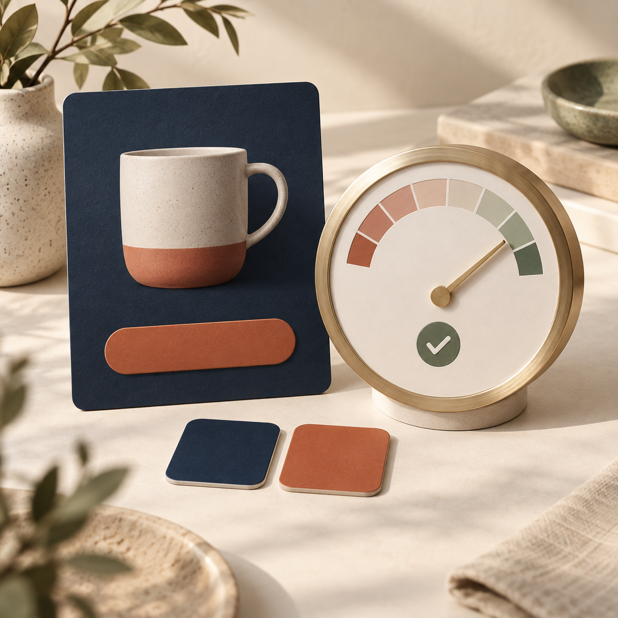
Paste the foreground and background values into Tiny Online Tools’ Color Contrast Checker. It reports the contrast ratio and checks common WCAG 2.1 thresholds, including AA normal text, AA large text, and the corresponding AAA checks.
For most product pages, treat normal text as the default test. A heading might be large enough to pass with a lower ratio, but a 14–16px variant label, price qualifier, or button label usually is not. If a pair fails, you do not necessarily need a new palette. Often the clean fix is to darken the text, lighten the surface, or reserve the lighter brand color for an icon, border, or large decorative area instead of a small label.
4. Review the result in Shopify, not only in a checker
A passing ratio is a useful guardrail, not a final design review. Put the adjusted pairing into your product template and check it where shoppers will see it:
- on mobile, where product information stacks tightly
- beside the main product image, where a busy crop can change perceived readability
- in the selected variant state and any sold-out state
- with a real product name that wraps to two lines
I would also compare your color treatment against the way you present options. If swatches are doing the work of a color name, the rule differs from text-on-background contrast, but shoppers still need an unambiguous selected state. This guide on making Shopify collection pages easier to scan with color swatches is a good companion check.
5. Optimize the approved image, then keep the original safe
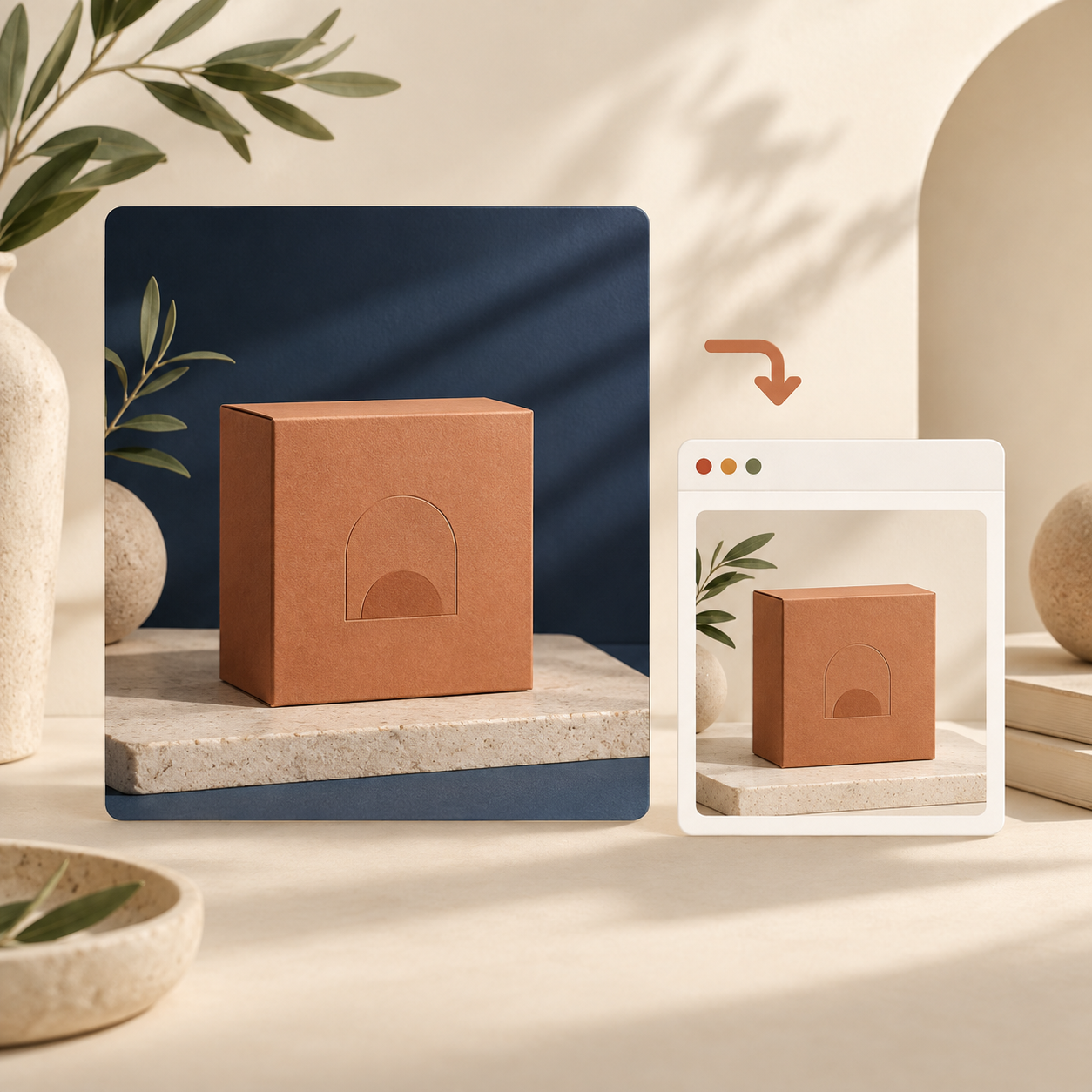
Once the visual and contrast choices are approved, prepare the final product asset for the storefront. The Compress Image tool lets you reduce image file size in the browser and preview the tradeoff before downloading. If you are standardizing formats, the Image Converter supports common JPG, PNG, and WebP conversions.
Keep one high-quality source outside Shopify, then upload the reviewed storefront version. That makes future campaigns less fragile: you can create a new crop or format without trying to recover quality from an already-compressed storefront image.
A five-minute product-page contrast preflight
Before you publish a new product or seasonal refresh, run this sequence:
1. Open one real product page and list its action-driving text and states.
2. Sample any photo-derived or campaign-derived colors.
3. Test text, button, badge, and link pairs in the contrast checker.
4. Adjust the role of a color when it is too light for small text.
5. Review the working page on a phone and with a long product title.
6. Compress or convert only the approved product image version.
The goal is not to turn every product page into a formal accessibility project. It is to catch the few small choices that make a product page feel harder than it should. Start with your current bestseller: sample its real colors, check the add-to-cart and price pairings, and make one clear improvement before rolling the pattern across the catalog.
Comments
Post a Comment