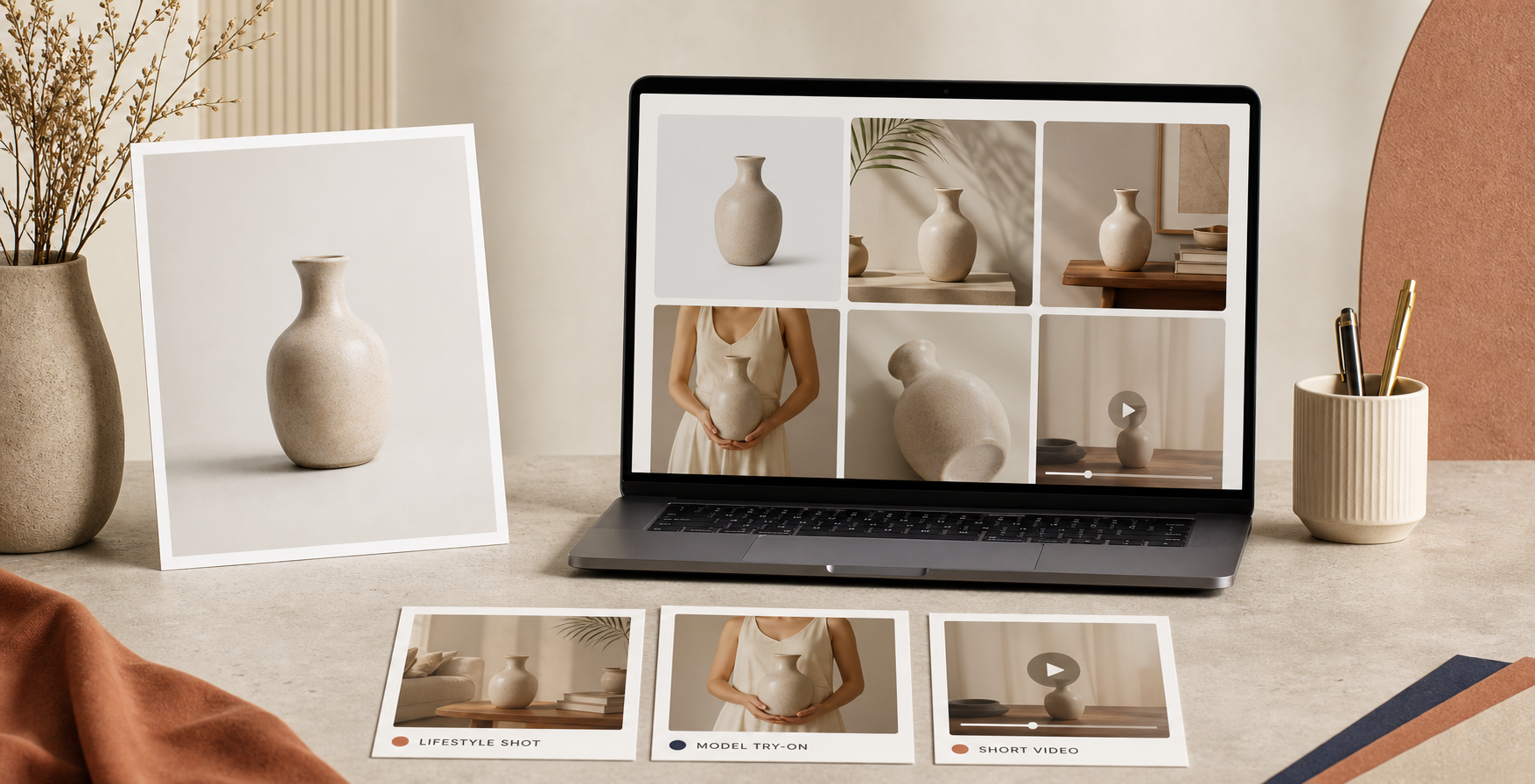
If you only have one usable product photo, you do not need a full photoshoot to make it useful. I usually turn that single image into a small visual kit: a cleaned-up listing image, a lifestyle shot, a try-on or placement scene, and a short motion asset for ads. Supra AI Photo Studio is built for that sequence, and the Shopify app listing is the quickest place to compare the app with the workflow below.
TL;DR: start with a decent source image, isolate the product, generate the cleanest listing asset first, then expand into lifestyle, try-on, and motion. The goal is not more images for their own sake. The goal is a coherent set of assets that all look like they came from the same brand shoot.
Start With One Source Image That Can Survive Editing
The biggest mistake I see is trying to generate lifestyle scenes from a photo that is already too soft, too dark, or too busy. The product help page for Supra AI Photo Studio recommends the same thing I would: isolate the product first, then work from a higher-quality source. That usually means background removal, sharpening, upscaling, and basic lighting correction before you move to anything more creative.
The editor is laid out in a way that makes that sequence straightforward. You get a top bar for navigation, a tools panel on the left, a canvas on the right, and an image gallery at the bottom. That matters because it keeps the work anchored to the same source asset while you test variations.
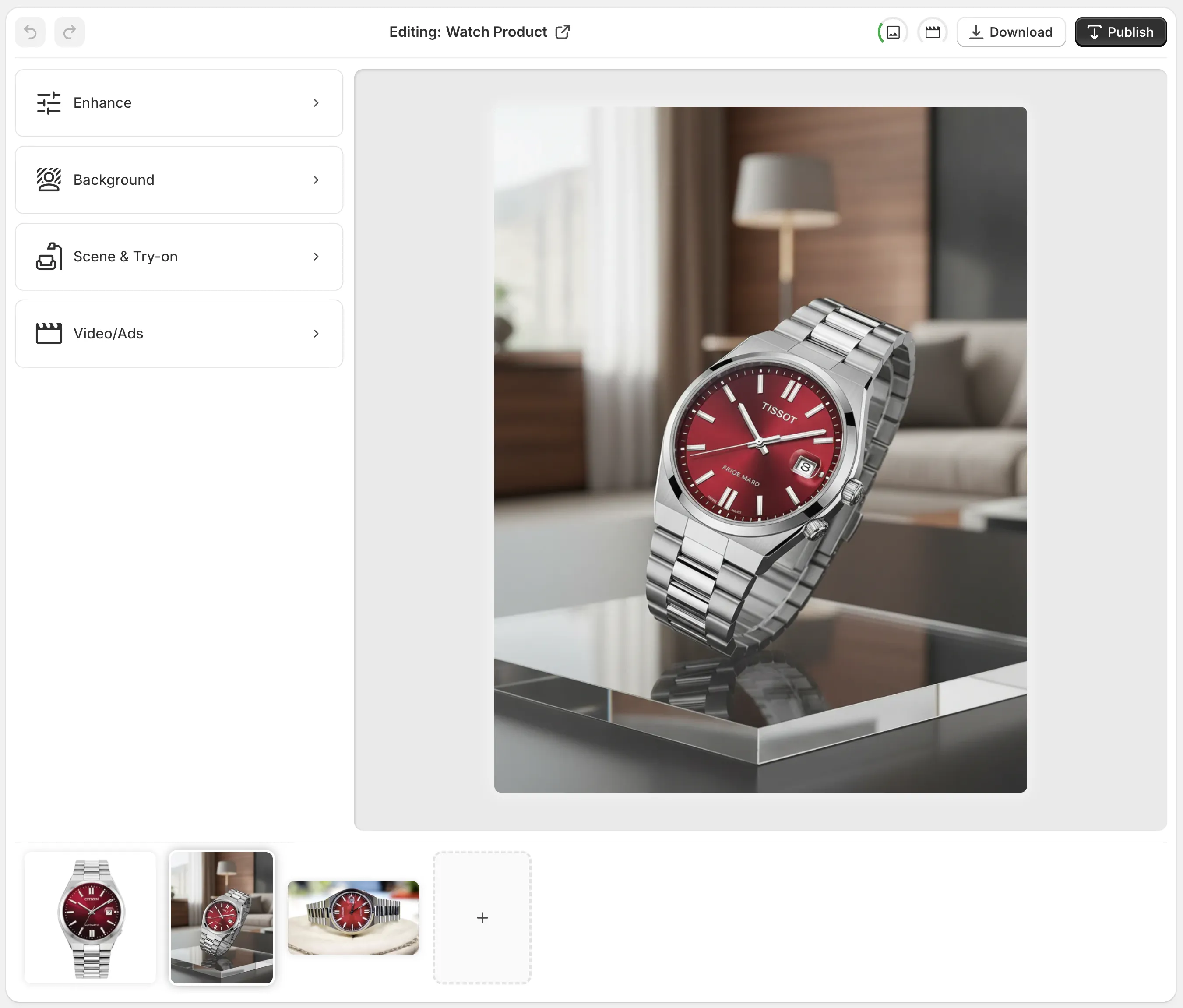
At this stage I usually ask one simple question: does this photo have enough clarity to support a product page? If the answer is yes, I keep moving. If the answer is no, I fix the source first instead of trying to rescue it with a more dramatic prompt.
Build The Listing Shot Before You Chase The Fancy Stuff
Once the source is clean, I make the product page asset first. That means a clean image with a simple background, correct crop, and enough contrast to read quickly on mobile. Only after that do I move into the more opinionated outputs, like lifestyle placement or on-model visuals.
This is the step where How to Turn Plain Shopify Product Photos Into Lifestyle Shots still holds up as a useful companion piece. I treat that post as the narrower version of this workflow: the lifestyle step is important, but it is only one part of a bigger asset set.
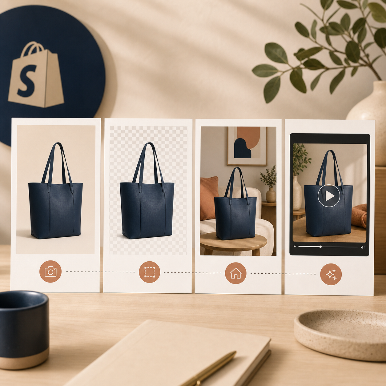
Supra AI Photo Studio gives you a few obvious levers here: remove or replace the background, improve resolution and sharpness, and apply automatic lighting correction. For many stores, that is already enough to turn an ordinary image into a convincing listing visual.
What I want from the first pass
- A product silhouette that reads instantly.
- A background that does not compete with the item.
- A crop that works on a product page and in a collection grid.
- Consistency with the rest of the catalog, not a one-off experiment.
Add Model Try-Ons And Placement Scenes Next
After the listing shot is stable, I move into the images that help a shopper imagine ownership. That may be a model try-on for apparel and accessories, or an object-placement scene for home and lifestyle products. The app supports both approaches, and the product file makes that clear: try-on for apparel, object placement for scenes, and more context around the item without rebuilding the whole shoot.
For apparel brands, the model try-on step is usually the fastest way to answer the question, “What does this look like on a person?” For home goods, the placement step answers, “Where does this live in the room?” The right answer depends on the product, but the decision is the same: show the item in a context the customer already understands.

If you want to go deeper on motion after that, pair this workflow with How to Create UGC-Style Shopify Product Videos Without a Production Team. That post focuses on the video side. Here, the useful idea is simpler: still images come first, and motion works better when the source asset set is already clean.
Use Motion Only After The Still Assets Feel Coherent
Supra AI Photo Studio also supports UGC videos and b-roll videos, which is where a lot of stores get tempted to jump too quickly. I would not start there unless the stills already feel aligned. If the still assets are inconsistent, the motion clip just amplifies the mismatch.
When the stills are ready, motion gives you a nice extension of the same creative direction. You can generate something that feels like an ad, a social cut, or a product-page accent without starting from scratch. That is especially useful for launch weeks and paid traffic tests, where you need a fast way to see what actually gets attention.
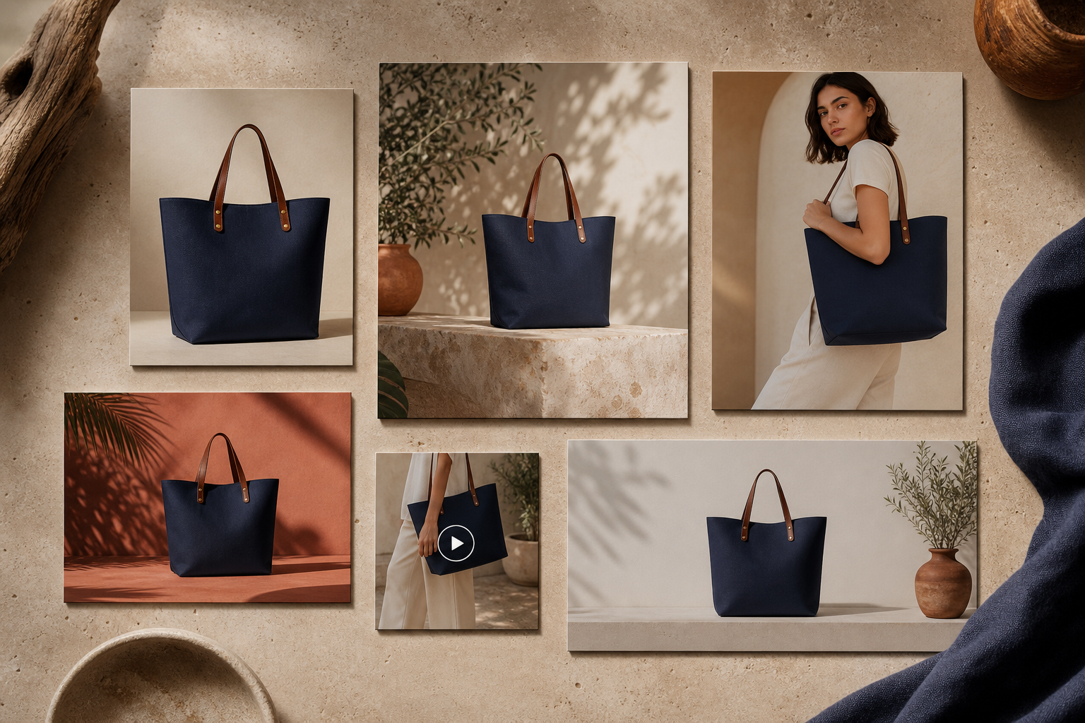
One practical rule helps here: if a motion idea changes the product more than it presents the product, it is probably too far from the source. The best clips preserve the item and simply improve the scene around it.
Decide Which Products Deserve The Full Treatment
Not every SKU needs the same amount of work. I usually reserve the full visual-kit pass for the products that matter most: hero products, high-traffic items, expensive items with more customer hesitation, or products I plan to feature in ads and email. If you are still deciding where to spend the time, the prioritization logic in How to Rank Shopify Products for 3D Capture by Return Risk is a useful way to think about it.
The same idea also pairs well with How to Build a Shopify 3D Capture Scorecard That Works. Different tool, same principle: start with the products where better visuals are most likely to change the sale.
For broader consistency, I also like to keep the palette, angle, and scene logic stable across the set. That way the listing image, the lifestyle image, and the ad creative feel like a system instead of random outputs. The app’s object placement and enhancement tools make that easier to enforce without having to rebuild your whole process around a designer.
The Simple Workflow I Would Use First
If I were starting from scratch, I would do this in order:
- Upload the best source image I have.
- Remove distractions and clean up lighting and sharpness.
- Generate the product-page image first.
- Produce one lifestyle or placement version.
- Add a try-on or motion variation if the product category supports it.
- Keep the outputs aligned so the set looks intentional.
The nice part is that this does not require a design team or a long production cycle. The app’s help page makes the workflow clear, and the free plan is enough to test the core loop before you scale up. If you want to compare the app directly, the Shopify listing and the landing page show the feature set in plain terms.
And if you are turning these product wins into a larger content engine, How I Build a Shopify Blog Queue From Launches, FAQs, and Collections is the next layer I would add. That is where the photos stop being isolated assets and start feeding the rest of the marketing machine.
Bottom line: one decent photo is enough to begin. Clean it, standardize it, then expand it into the exact formats your store needs. Start with one SKU, build the full visual kit, and use the result as your template for the next product.
Next step: pick one product that deserves better visuals and run it through Supra AI Photo Studio end to end.
Comments
Post a Comment