How to Use Lifestyle Images Without Replacing Your Shopify Main Photo
on
Get link
Facebook
X
Pinterest
Email
Other Apps
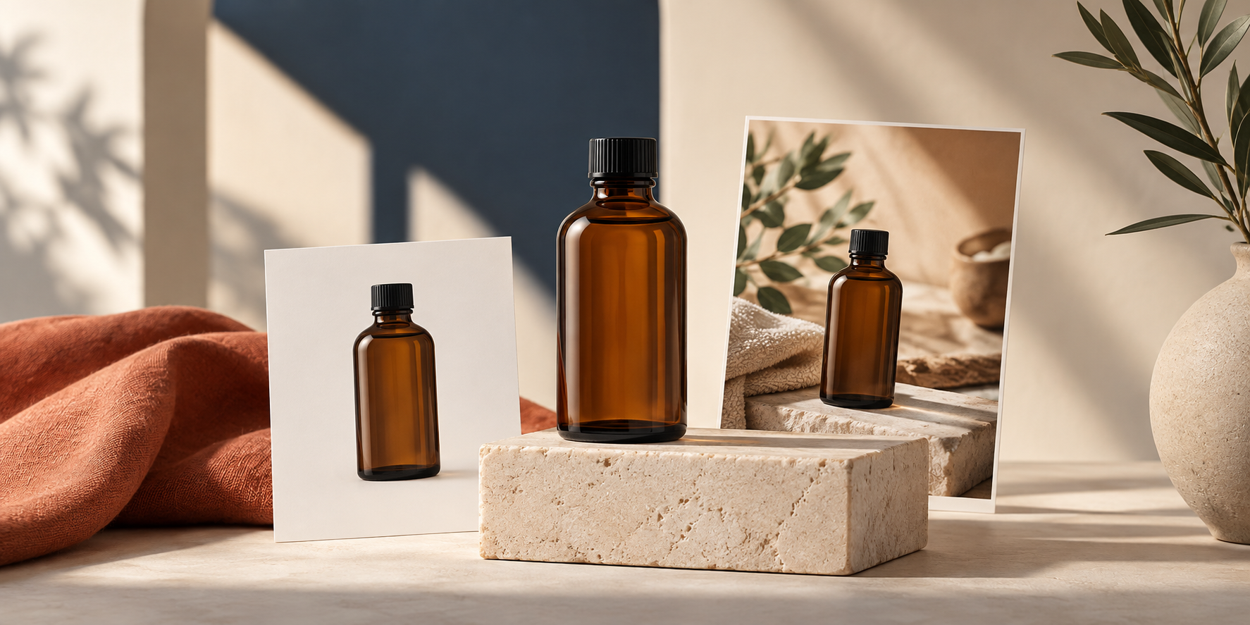
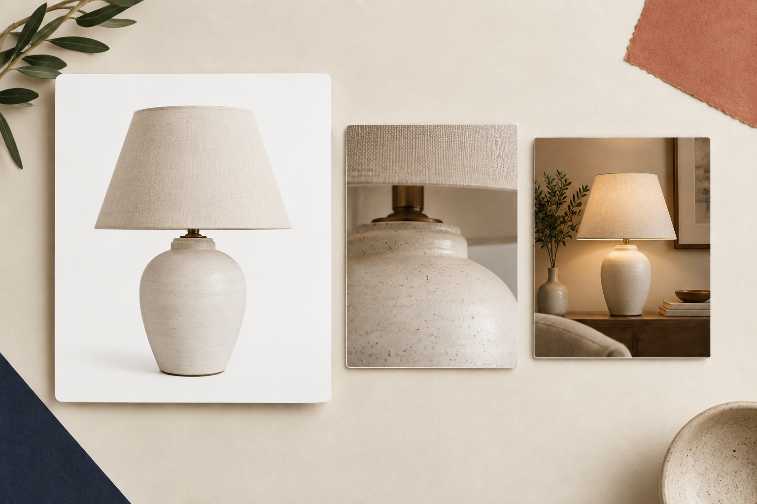
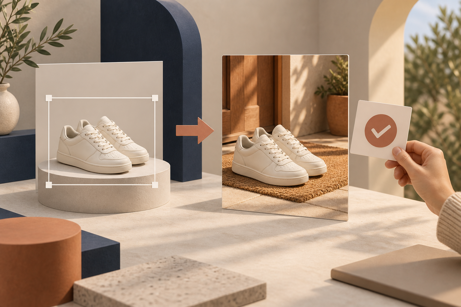
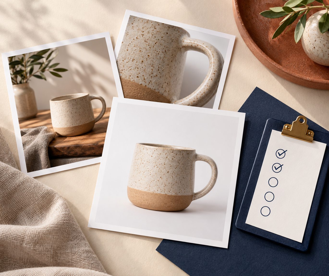
If you are wondering whether a lifestyle photo should replace your Shopify main image, my short answer is usually no. Keep the first image simple enough to identify the product at a glance, then use lifestyle images to answer the next question: what does this look like in real life?\n\nI have seen stores trade a clear product shot for a beautiful scene and accidentally make comparison shopping harder. A shopper who lands from search still needs to recognize the colour, shape, material, and exact item before they can appreciate the mood. The useful middle ground is a gallery where the first image proves the product and the next images help someone imagine owning it.\n\nTL;DR: Keep a clean, accurate main image first. Add one supporting lifestyle image when it explains scale, use, texture, or setting better than the primary photo can. Review it against the original before publishing.\n\n## Start With One Job for Each Image\n\nA product gallery works best when every image earns its place. Before generating or choosing a lifestyle image, give it one job:\n\n- Main image: identify the exact product quickly.\n- Detail image: show material, finish, hardware, or a relevant close-up.\n- Lifestyle image: show scale, use, mood, or context.\n- Try-on image: answer fit and styling questions for apparel, jewellery, or accessories.\n\nFor example, a ceramic mug’s main image can be a clear front view on white. Its lifestyle photo might show it on a breakfast table, which helps the shopper understand its warmth and everyday setting. It should not hide the handle, change the glaze colour, or introduce a different-sized mug. This simple division also makes it easier to keep Shopify product photos consistent across your catalog.\n\n\n\n## Keep the Clean Product Shot First\n\nYour first gallery image has a practical job: it must work in collection grids, search previews, ads, and on a product page where the shopper has not read a word yet. I would keep it uncluttered, well lit, and as close to the actual product as possible.\n\nThat does not mean every first image needs a pure white background. A simple branded backdrop can work when it still makes the product unmistakable. The test is straightforward: if someone saw the thumbnail for two seconds, could they tell what is being sold and which option it is? If not, make the product shot clearer before adding more creative images.\n\nPut the lifestyle image second or third, after the shopper has the basic visual facts. That order lets the scene add persuasion rather than asking it to carry identification alone. It is especially helpful for home goods, beauty, accessories, and products whose scale is difficult to judge from an isolated image.\n\n## Create a Lifestyle Image From a Trustworthy Source\n\nA good source image makes every later decision easier. Choose a well-lit photo that shows the full product, important edges, and its correct colour. For many products, I would isolate the item first so the generation has a cleaner reference. Then describe the environment precisely: surface, room type, angle, lighting, and the reason the scene is useful.\n\nWith Supra AI Photo Studio, a merchant can start from a Shopify product image and use object placement to place it in a relevant setting, alongside tools for background changes, enhancement, upscaling, and fashion try-ons. The goal is not to manufacture a dramatic scene for every SKU. It is to create one image that makes a real buying question easier to answer.\n\nFor a desk lamp, ask for a bedside table scene to communicate scale and warmth. For a bag, choose a setting that shows how it sits against a body or fits into a commute. For a skincare bottle, use a bathroom shelf or vanity that supports the product category without crowding the frame. If a scene adds no new information, save the gallery space.\n\n\n\n## Run an Accuracy Check Before Publishing\n\nAI-assisted images deserve a quick human check, especially if they will live beside your product data. Compare the lifestyle result with the original and check these points:\n\n1. Silhouette: Are the proportions, seams, handles, fasteners, and edges still believable?\n2. Colour and material: Did the fabric, finish, pattern, or shine drift from the original?\n3. Count and configuration: Does the image show the same number of items and the same product version?\n4. Use claim: Does the scene imply a use or included accessory your listing does not support?\n5. Crop: Is the product still easy to see on a phone-sized screen?\n\nIf anything feels uncertain, keep the clean product image as the source of truth and regenerate the supporting scene with a narrower prompt. The editor in Supra AI Photo Studio lets you work from a product or uploaded image, review it on the canvas, and publish changes back to the product gallery when you are happy with the result.\n\nThis review step fits naturally with the three-pass check before publishing AI product photos and prevents a lifestyle image from quietly becoming a misleading product claim.\n\n## Add Context Without Creating a Mismatched Gallery\n\nOne common mistake is treating a lifestyle photo as a completely separate campaign. It may be attractive on its own but clash with the product page because its lighting, crop, or styling feels unrelated to the rest of the catalog. Use a small set of rules across your batch: similar warmth, a consistent amount of negative space, and scenes that serve a recognizable shopping question.\n\nYou can also create a lightweight brief before generating: product, audience, image job, environment, must-preserve details, and what the image must not imply. That is a smaller version of the planning discipline behind choosing the first Shopify product for a lifestyle-photo test. It keeps experimentation focused and makes it easier to learn what improves engagement.\n\nFor launches, resist adding lifestyle photos to every product at once. Start with a small set of products that have a clear context problem—an item with uncertain scale, a material shoppers need to picture, or an accessory whose use is hard to explain. Then compare the gallery experience, customer questions, and product-page performance before expanding the workflow.\n\n\n\n## A Simple Gallery Order to Try Today\n\nFor most physical products, this is a sensible starting order:\n\n1. Clear main product image.\n2. Key detail or alternate angle.\n3. Lifestyle image that answers one buying question.\n4. Optional scale, try-on, or use-case image.\n\nIf you also make video assets, keep the same principle: a clip should show one useful idea, not replace the product facts. That is why it helps to plan Shopify UGC videos before a product launch instead of treating every visual as a generic promotional asset.\n\n## The Next Step\n\nPick one product whose gallery is clear but unconvincing. Keep its current main image, write down the one question a lifestyle scene could answer, and create one supporting version. Compare it side by side with the original before it reaches the live product page.\n\nIf you want to do that inside your Shopify workflow, try Supra AI Photo Studio to turn an existing product image into a more useful supporting scene—while keeping the original product photo where shoppers need it most.
Comments
Post a Comment