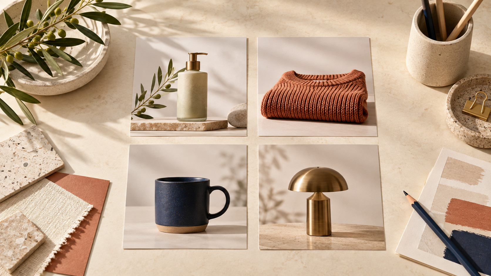
A collection page can make a store feel considered—or make it hard to tell what is actually for sale. The quickest fix is not generating more AI imagery. It is assigning every image a job before it reaches the collection grid.
I have seen small stores add beautiful lifestyle images, then discover that shoppers cannot quickly compare color, material, or product shape. The answer is a simple hierarchy: use dependable product-first images to help people browse, and use AI lifestyle images to add context where they earn it. Supra AI Photo Studio is useful here because it lets a merchant start from an existing product photo, clean it up, and create a controlled scene or on-model variation from the same source.
Start With Three Image Roles
Give every collection image one role. This keeps creative work from turning into an unplanned mix of crops, backgrounds, and visual claims.
1. Browse image: the clearest honest view of the item. It should make the product easy to recognize in a small tile.
2. Context image: a lifestyle scene that answers a useful question, such as scale, intended setting, or how an item is worn.
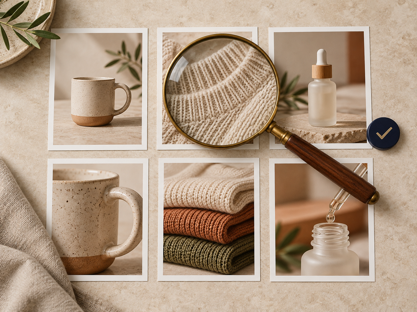
3. Detail image: a closer view that proves texture, hardware, finish, or a feature that affects the buying decision.
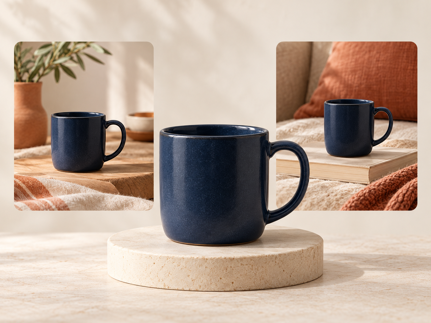
For most collection grids, the browse image should lead. A lifestyle scene can be powerful, but it should not force a shopper to guess whether the navy mug, tote, or sweater is the item behind the card. If you are still deciding which products deserve that extra context, begin with a small test rather than the full catalog; this guide on choosing a first lifestyle-photo test is a helpful starting point.
Decide What the Collection Page Must Help Shoppers Do
Before opening an editor, write one sentence for the collection. A bedding collection might need shoppers to compare colors and textures. A skincare collection may need to show format and routine. A gift collection may need to show occasion and scale. That sentence tells you whether a lifestyle image belongs in the grid, on the product page, or only in a campaign.
Use this quick filter for each candidate image:
- Can someone identify the product in a small thumbnail?
- Does the scene clarify a decision instead of merely decorating the grid?
- Does the image keep the correct color, silhouette, material, and included pieces?
- Will it sit beside neighboring cards without making the collection feel visually noisy?
If the answer to the first question is no, keep the image as a secondary product-page image or a social asset. That is the same principle behind using lifestyle images without replacing the main photo: inspiration should support certainty, not replace it.
Build One Clean Source Before Generating Variants
AI scenes are easier to control when the starting product image is clear. Use a high-resolution photo with visible edges, accurate color, and minimal background clutter. For apparel, make sure the garment shape is readable before considering a try-on. For objects, isolate the item first so the environment does not become part of the product.
Inside Supra AI Photo Studio, a merchant can choose a product or upload an image, then use background removal, enhancement, object placement, or try-on tools. I would make the clean source image the “anchor” and preserve it. Then create only the variation needed for a specific role. That restraint is what keeps a collection coherent.
Make the Scene Do One Useful Job
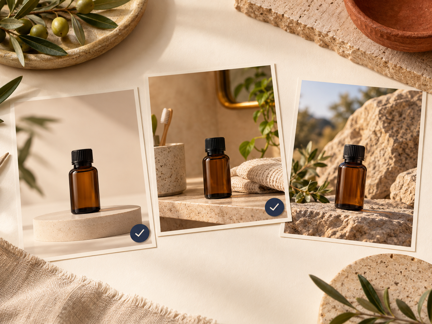
A good prompt or direction describes a product situation, not just an aesthetic. Instead of “luxury lifestyle,” use a bounded instruction such as: “Place this amber bottle upright on a warm stone bathroom shelf, soft morning light, product label and bottle shape unchanged.” For a knit, you might ask for a folded garment in a quiet living-room setting where the weave remains visible.
The test is simple: when a shopper sees the scene, what do they learn?
- Home goods: scale, surface, room fit, or material mood.
- Beauty: routine, texture, or bathroom-shelf context.
- Apparel: drape, proportion, or styling idea.
- Accessories: size, wear position, or use case.
Avoid making every product tile a different world. Choose two or three repeatable scene families—perhaps warm stone, soft linen, and one outdoor setting—and keep camera distance and lighting compatible. A reusable Shopify product-photo shot list makes that decision far easier to repeat across a collection.
Review at Collection-Grid Size, Not Just Full Screen
This is where many polished images fail. A scene can look excellent at full size but become vague when reduced to a small card. Preview several products together and look for three problems: the product is too small, the background competes with it, or adjacent cards have unrelated lighting and crops.
I use a five-card check: line up the proposed first images for five neighboring products and ask a colleague—or simply step away for a few minutes—then come back and name each product at a glance. If that is difficult, swap in the anchor image.
Also check product truth. Do not publish a generated image if it changes a colorway, adds a feature, removes a closure, alters texture, or implies an included item. A simple catalog-standard process is described in this guide to building a premium Shopify image workflow; the important point is that every creative variation still needs an approval pass.
Use a Small Pilot Before Reworking the Catalog
Pick one collection with 6–12 related products. Keep the original browse image for every item, add one context image only where it answers a shopper question, and use the same scene rules across the set. After publishing, review the grid on mobile and desktop. Look for confusion in customer questions, returns, or common browsing paths before scaling the pattern.
If you want a practical way to make a few existing photos work harder without scheduling a new shoot, try Supra AI Photo Studio. Start with one trustworthy product photo, create one controlled variation, and keep the version that makes the collection easier—not merely prettier—to shop.
The best AI product image system is quiet. Shoppers notice the products, understand the differences, and move confidently to the product page. Give each image a clear role, protect the anchor photo, and let lifestyle context do its useful supporting work.
Comments
Post a Comment